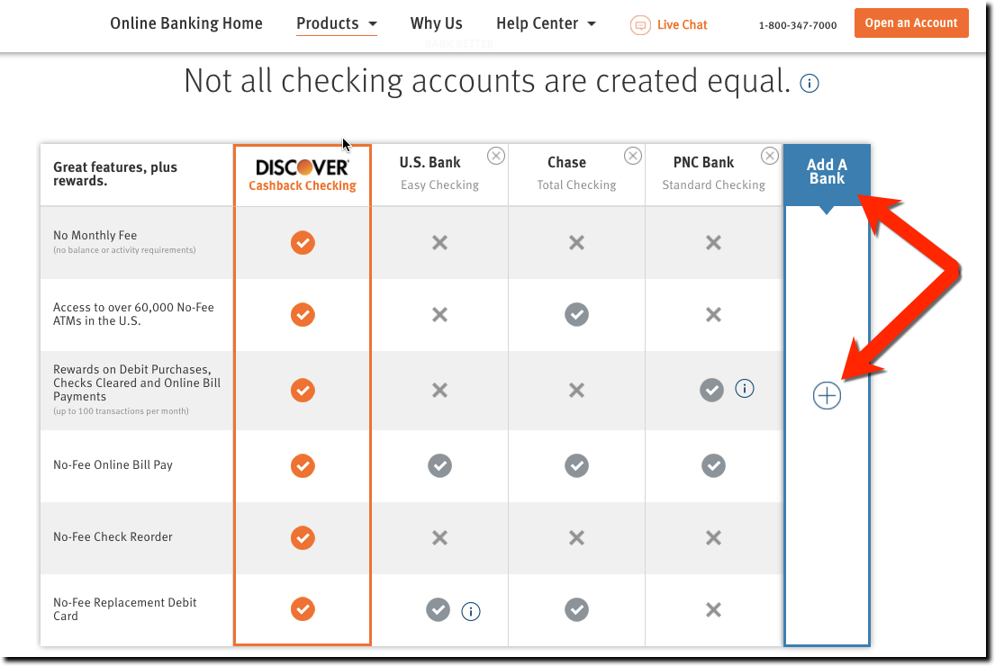
We’ve seen many comparison tables matching a financial institution’s (usually a credit union) best checking account to the competition (usually the mega banks). But we don’t recall an interactive one (outside third-party comparison sites).
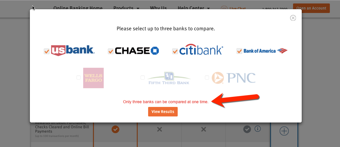
Discover’s page dedicated to selling its Cashback Checking is a thing of beauty from top to bottom. But we especially appreciated the interactive comparison. Discover defaults to comparisons to Chase, Citi, and BofA. But the card giant makes it super easy to compare against four other major brands (Capital One, US Bank, Wells and Fifth Third). Simply click on the + sign in the empty fifth column on the right and choose one of the brands from the popup (see below).
The table works on smaller screens including smartphones. But you can only compare to one other bank at a time. Users select the competitor with from a drop-down box.
Recommendations:
- To increase its credibility, Discover should expand the number of banks to compare against, which only adds to its credibility.
- We were surprised there weren’t any digital features mentioned such as mobile deposit. Even if Discover is at parity with the competition, many prospective customers are going to use this list of features to evaluate Discover’s checking account.
- While I love the punch they deliver by highlighting their own features/benefits in orange vs. light gray for everything else. But it does make it hard to read, especially on a smaller screen. We recommend increasing the font size and boldness at least in the first column listing the features.
- There is small UX issue when adding a bank. SInce there is an empty fifth column, users expect to be able to fill it with one of the banks from the popup. But if you select another bank, the form gives you an error message “Only 3 banks can be compared at a time.” This is annoying because it’s obvious the table has a blank column. The popup box should make it clearer (besides the mousetype instruction) that only 3 banks can be selected at a time or the table should be changed to allow four comparisons.
- Another problem is that the unselected banks are grayed out. Usually grayed out means “not available to choose” which is not the case here. None of the choices should be grayed out, they should just have a check or not.
For extra credit:
- Being the geek that I am, I’d love to see a total score at the bottom of the chart so I could decide myself who the winner is. This is a tricky calculation and would require users to assign weightings to important features and/or input their normal transaction volume to calculate rewards totals. But this complicates things and could hurt conversions. Perhaps, Discover should offers a “cash-back calculator” outside the comparison chart.


