Although I find the upside-down background disconcerting (note 1), the overall messages on Quicken Loan’s (QL) Rocket Mortgage homepage are excellent. Let’s break it down.
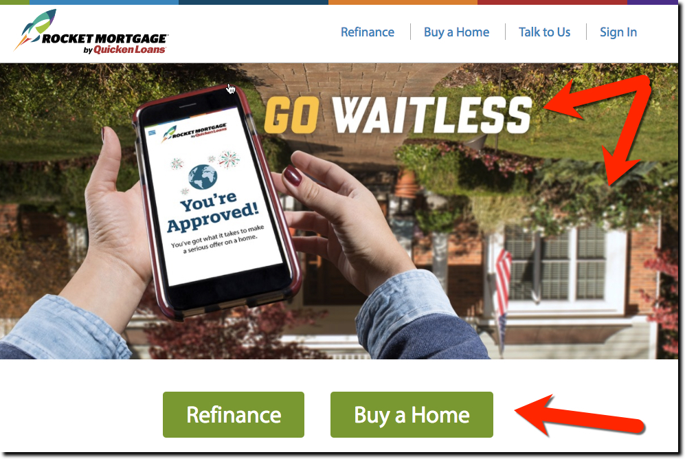
Screenshot 1: Above the fold
This is the weakest part. I like the “waitless” pun, though I’m not sure it’s the best way to engage customers. However, let’s assume the vast majority of visitors arrive after being exposed to the mortgage company’s advertising. So most are already intrigued enough to scroll down.
Good:
- Little copy
- Clearly explains what they do with Refinance and Buy buttons front and center
Bad:
- Pun may go over people’s heads
- The ’70s filter and upsidedown graphic makes a bad first impression, it looks like a low-budget mortgage broker website at best.
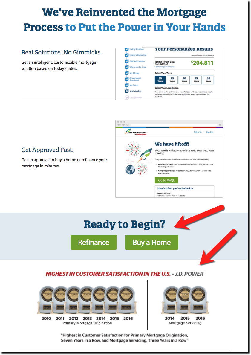 Screenshot 2: Rest of Homepage
Scrolling down the page, QL does a great job listing key benefits including:
- No paperwork: For anyone who’s ever gone through the mortgage process before, this is a huge issue. The promise of less paperwork is a good, tangible benefit.
- Real prices: Another big problem for online shoppers is the
bait-and-switchlack of transparency of the final cost of financial products, especially loans. Another great pain point addressed by QL - Fast approval: While the whole rocket theme revolves around this, the company found that the convenience and value trumps speed, so it’s relegated to third place. Still very important.
- JD Power trophies: If you got it flaunt it. The row of 10 trophies at the very bottom is impressive. Maybe that should be the above-the-fold image.
 Screenshot 3: Mortgage application landing page
Lot’s of lookie-loo visitors go to the app for a better understanding of the process. So don’t assume you’ve hooked the prospect just yet. You must keep selling/reinforcing the value prop. QL doesn’t disappoint, leading with an superb 3-minute how-to video integrated into the main image. However, the design is a bit too subtle; I missed the play button the first time through. QL should frame it to make it more obvious.
Under the image, QL reinforces three key benefits
- Simplicity
- Speed
- Control
They close the page with a thorough How it Works section with 5 step listed across the page with short descriptions. And there are two prominent Let’s Begin buttons.
 Screenshot 4: Registration
QL avoids one of the biggest sticking points in the typical lender’s marketing funnel, making a prospect commit to an “application” as their first step in engaging with you. QL instead begins with an account registration process much like every non-banking site on the planet. You just enter your name and email, then select a username and password and voila, you are a QL customer. Once they have you hooked (or at least identified with an email address for follow-up), THEN they begin the real application process.
 Screenshot 5: Start an application
The application starts with a softball question to get you started; Whether you are a homeowner or not, followed by a huge green button to continue. Along the left is a list of application steps to track where you are in the process.
Bottom line: With a Super Bowl size advertising budget, Quicken Loans has spared no expense optimizing its customer conversion process. It should be on your shortlist of lending sites to share with your design team. Now if they could just get that guy on the homepage righted, all would be well. But given its response to my tweet, I don’t think that’s going to happen anytime soon (see below)!
Notes:
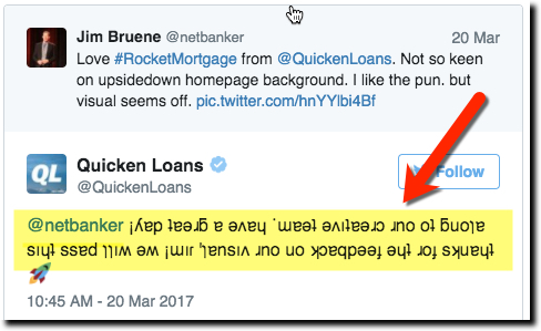
1. It’s refreshing to see a company with a sense of humor. Clearly, Quicken Loans does. Check out the tweet they fired back to me after I said I was a bit disoriented by the homepage image. Perfect-10 response!
