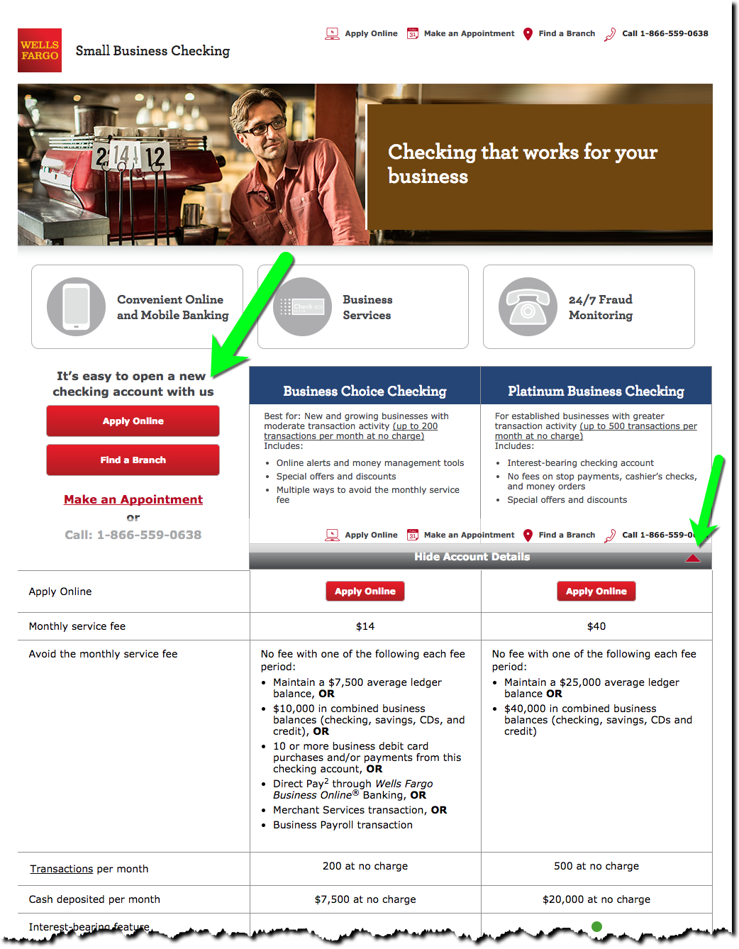
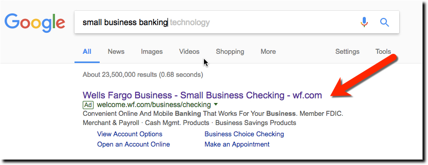
Wells Fargo has 3 million small business customers (source). And given the number that go belly up every year, the bank has to work hard just to stay at the same level (even harder with this kind of publicity). So, it's no surprise Wells is an aggressive bidder on “small business banking” terms on Google.
Today, we clicked on its ad (above) to see what they were doing to entice small businesses such as ours into the fold. The landing page is solid, especially for a bank. There is a clear call to action to an online app or you can schedule an appointment online. The bank leads with its two checking accounts, Business Choice ($14/mo waived with $10k on deposit or 10 debit transactions) or Platinum Business Checking ($40/mo waived with $25k on deposit). Pricing is readily available by clicking on the more info carrot below the account descriptions.
If you are a price shopper, the bank does a great job laying it out for you. But what if the digital benefits are at least as important as the price or transaction limits? It's not so easy to see what 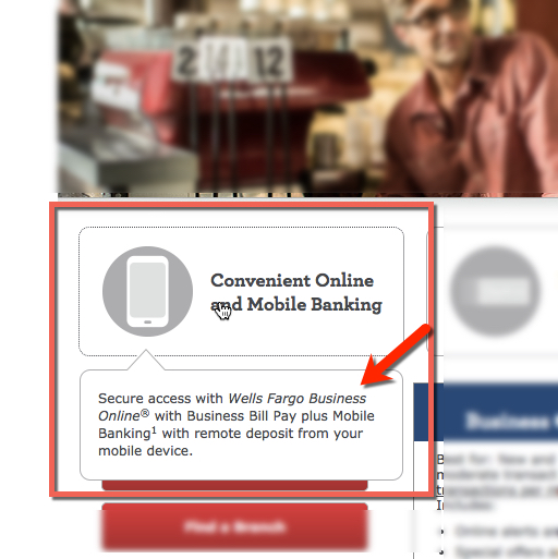 you are getting (see Update below). There is a promising smartphone icon with the title Convenient Online and Mobile Banking (see inset), but instead of leading to a summary of the bank's excellent digital features, a light-font popup you can barely read appears with a single nearly unreadable sentence that manages to call out “secure,” “mobile banking,” “remote deposit.” and “billpay” before mercifully ending after 21 words.
Recommendation: We understand the desire to keep visitors from leaving the landing page before pressing the Apply button. But today's small business customers need more than 21 words on digital banking before choosing your bank.
Here are four relatively easy improvements:
- Rewrite the popup box to list a half-dozen compelling digital banking benefits
- Increase the visual impact of the pop-up box so prospective customers pay attention to it
- Provide details (via popups) on the digital banking features in the checking account comparison chart (similar to what appears when you mouseover “transactions” in the list)
- Make the digital banking icon more appealing (it looks like a grayed-out version of the Oregon Ducks “O” logo than a smartphone)
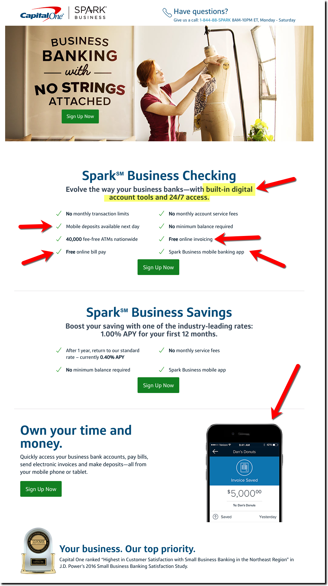
Update 3 May 2017: Capital One is also a leading bidder on “small business banking.” Its Spark Business Banking landing page is more along the lines of what we were thinking of (screenshot below).