I have written dozens of posts about Simple Bank (aka Simple) since they burst on the scenes in 2009. They have pioneered in a number of areas, notably, Safe to Spend, which should be on every bank’s product roadmap.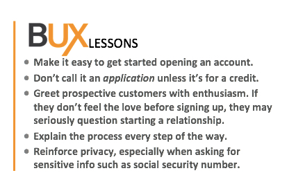
But what I like most about the BBVA unit is how the put everything together in one not-so-simple package. Everything they write, from its x/day Twitter posts, to the customer service responses, to the website/blog copy, has a clear and customer friendly voice.
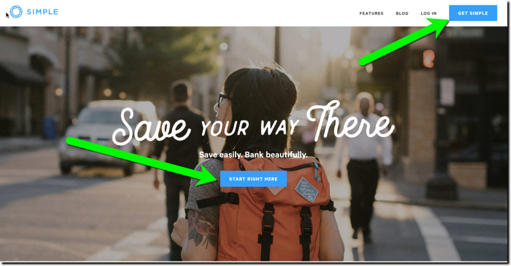
As you would expect, they obsess about the user experience. Take a look how they make it easy to get started with an application.
1. Don’t call it an application. It’s Start Right Here from a clear blue button in the middle of the homepage or Get Simple in a blue box in the upper right.
2. Greet your about-to-be-a-new-customer with enthusiasm and the respect they deserve. If you run a full-service FI and you good at digital relationship building between the generations, this new person and their children, have lifetime values in the thousands (maybe even $10,000+).
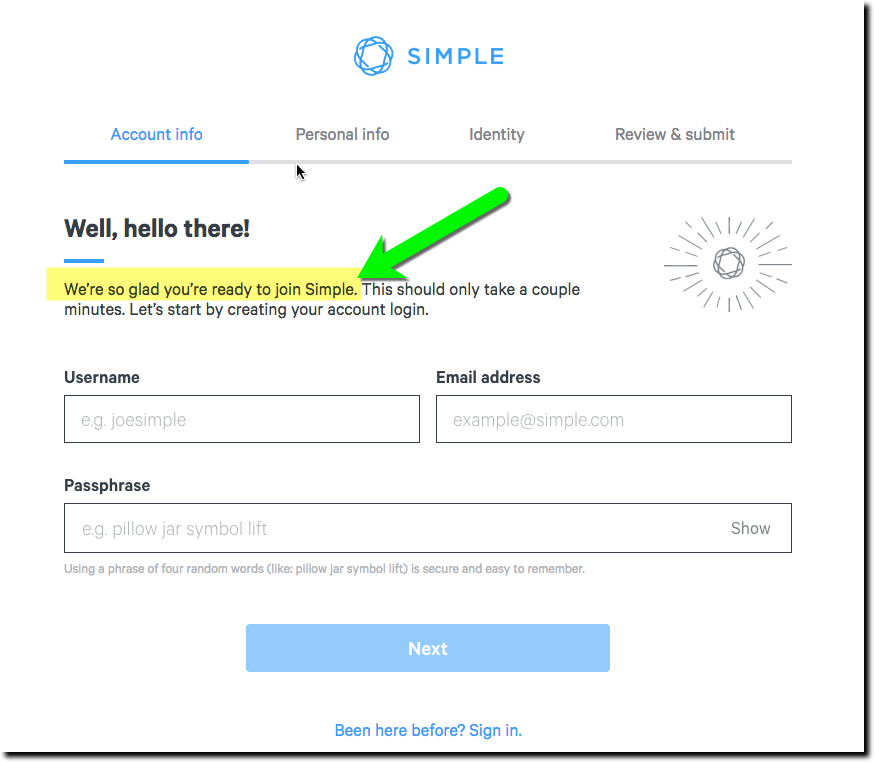
3. Move the customer forward with simple copy and keep them apprised of where they are in the application.
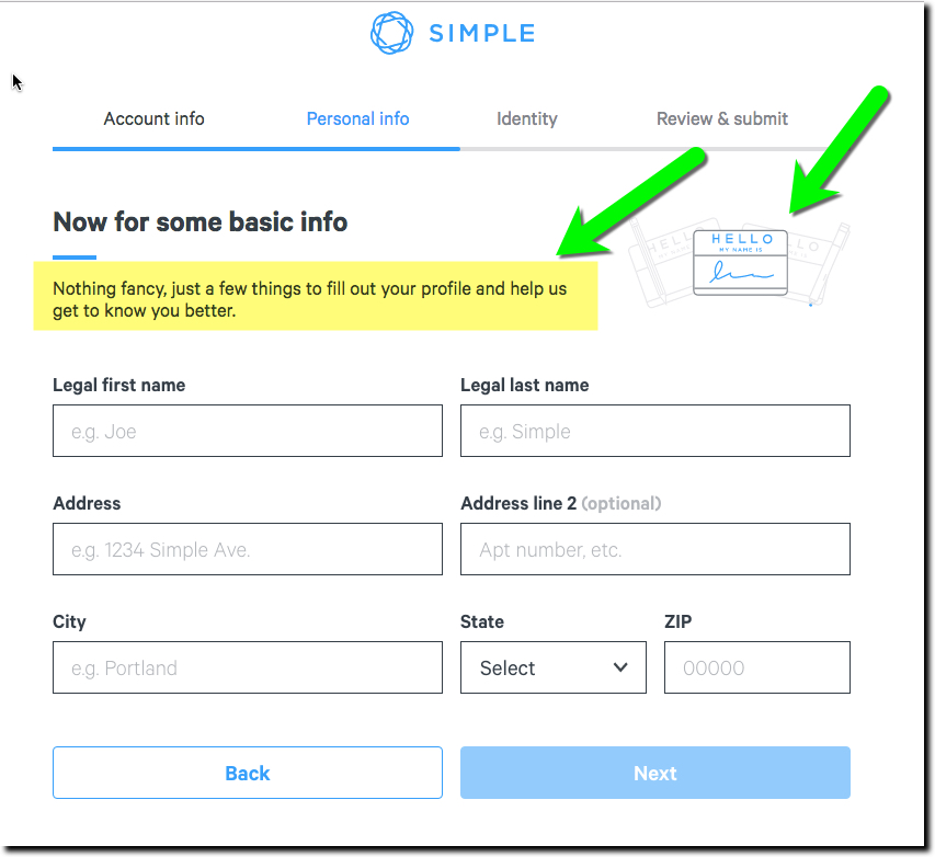
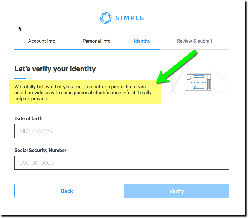
4. Let them know why you are asking for seemingly way-too-much personal info.
For extra credit: Remind them how secure you plan on keeping it (Simple doesn’t do that)
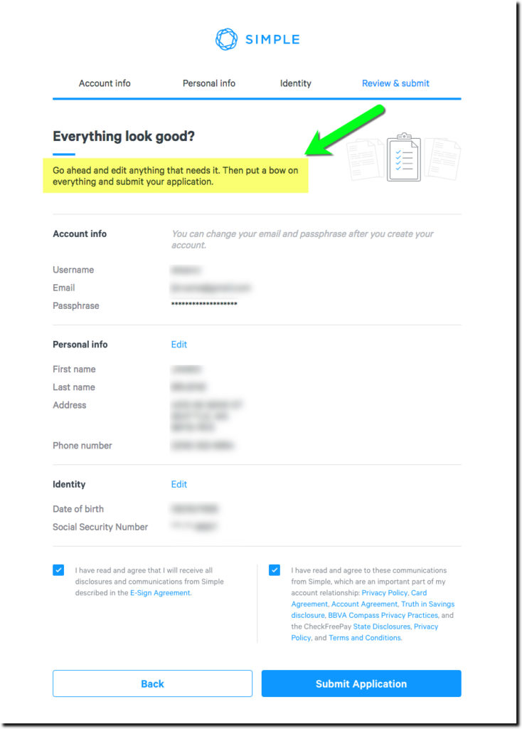
5. Review and submit.
6. Thank the customer!!! (No screenshots because we did not submit since we already have an account).
Bottom line: New account applications are where your digital P&L turns black. Make sure you obsess over yours.


