Featured Startups
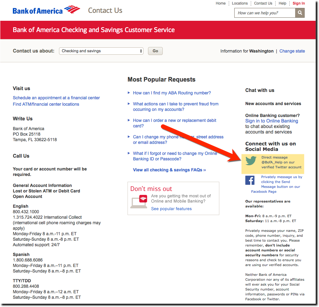
Customer Service UX: Bank of America Encourages Social Media Direct Messages
Bank of America's website and mobile apps are generally a showcase of best practices. The bank spends millions each year ensuring pixel perfect UI. But no one is perfect. Looking at its Contact Us page today (screenshot above), we were glad to see options to reach out...
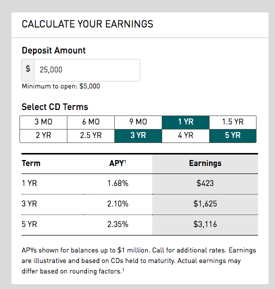
UX Case File: Everbank’s CD Rate Table Creates More Interest
Now that most serious digital banks sport solid-looking and responsive websites, we turn our attention to the hundreds of details that as a whole can differentiate you from the competition. And more importantly, show your customers AND employees, that you care....
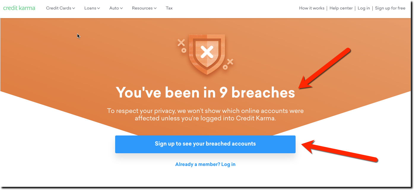
Credit Karma Does Breach Education Right (Security UX)
Remember thr Equifax breach? On the heels of the Equifax breach, we've had several months of renewed media focus on our (lack of) data privacy. And what we can do about it. We recently pointed out some financial institutions that did a good job making customers aware...
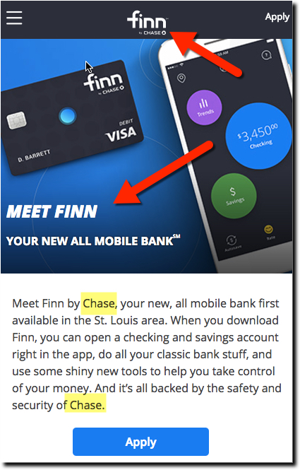
Chase Bank Tests Finn, a Mobile-First Brand
Meet Finn by Chase It's been 18 years since a big-10 US retail bank started a standalone deposit-taking digital brand. I'm sure the old-timers out there remember Wingspanbank from Bank One (now part of, you guessed it, Chase). And there's good reason for the drought....
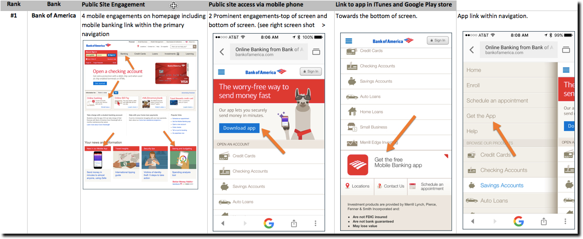
Homepage UX: Mobile Banking Discovery
Thanks to Pareto, we know 80% of your visitors are looking for just 20% of what you offer. And in that 20% is surely info about your digital offerings, especially mobile. But why do so many banks and credit unions bury their mobile capabilities? Let's take a tour of...
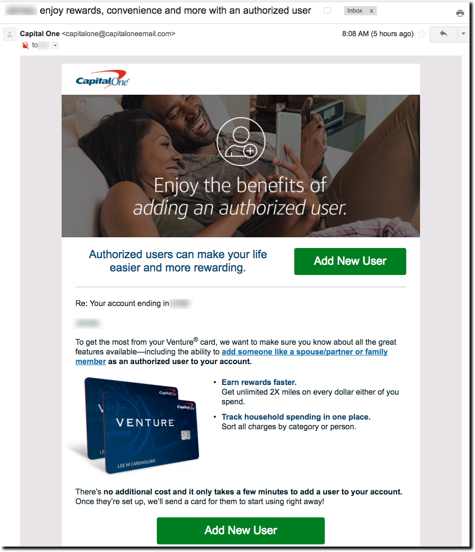
Credit/Debit Card UX: Authorizing a New Card User
Fine-tune the User Experience (UX) With Authorizing New Card Users As financial institutions digitize every product, process and procedure, there are thousands of tweaks necessary to fine-tune the user experience. For example (from our mobile UX framework): #132. Is...
Discovery UX: Making Mobile Banking Services More Visible
Mobile Banking Services Is Getting More Popular According to the Fed, mobile banking was used by 53% of smartphone owner in 2015, just 7 years after Apple opened its smartphone iOS to outside apps. In newer data fielded in June by Convergys (published by BofA), 62% of...
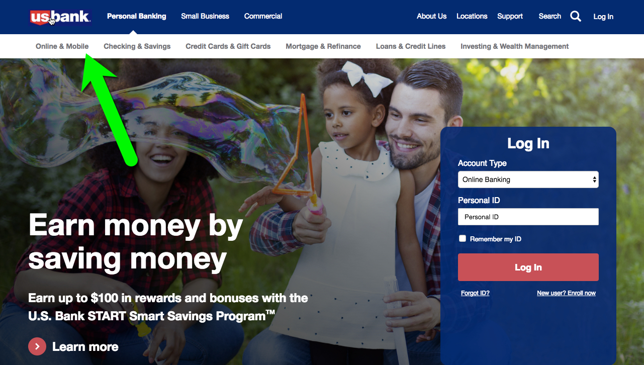
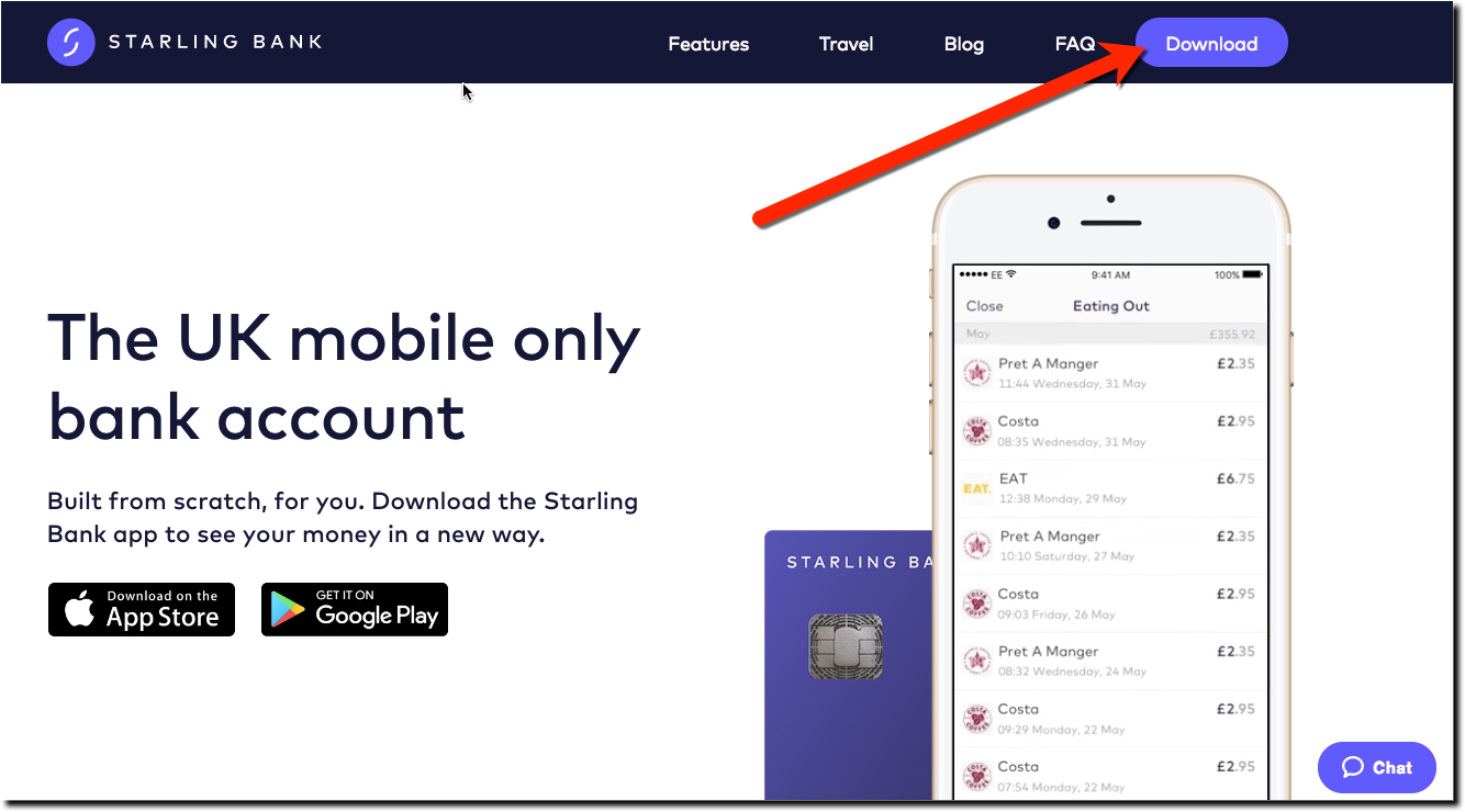
Navigation UX: “Download” is the New “Apply Now”
After reading CNBC's nice, albeit puff piece (worth a read) on Starling Bank's CEO Anne Boden, I headed to its website via laptop. As expected, the mobile-first British challenger bank has an attractive responsive site with three (of 5) primary navigation rarely, if...
New Digital Banking Benchmarking Service Helps You Prioritize Development Efforts
Digital Banking Benchmarking We are thrilled to announce the latest addition to our services, Digital Banking Benchmarking. Clients have been asking for it for years and we are excited to finally be able to show you exactly how you stack up against the big United...
Mobile UX: How to Ask for Permission to Track Location
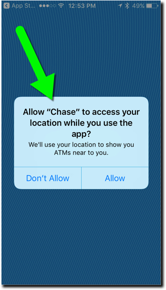
As part of our mobile UX framework we are constantly adding new guidelines so that we can better gauge the effectiveness of our client's offering to that of the "perfect" banking app. Our latest addition: #127. Do you use appropriate language when asking for...
Friday Fix: Trapped in a Mega Menu
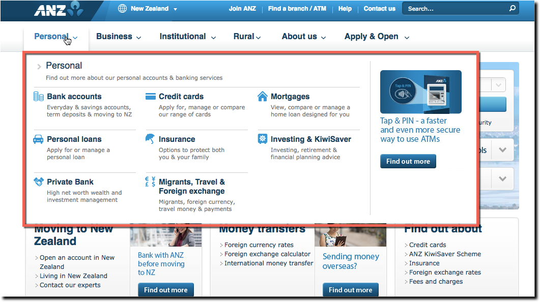
During the past 4 or 5 years, there has been dramatic improvement in banking websites as the responsive design movement has taken hold. Websites are much cleaner, far less cluttered, and more aesthetically pleasing. A big part the decluttering has been achieved by...
Payments UX: Zelle Confuses
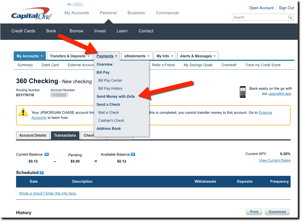
What is Zelle? There has been little criticism of the new Zelle-branded P2P payment service, probably because it's been working great as a white-label solution at its bank owners for six years. But I'm not convinced the rebranding as Zelle is step in the right...
Friday Foibles: TD Bank Has Great Online Account Opening UX, Unless You Live West of the Mississippi
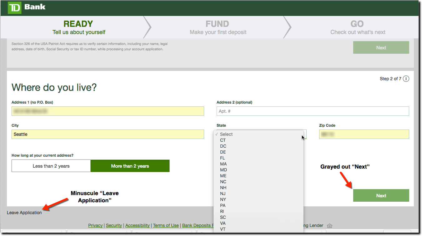
Last time I checked it was 2017. Why would a major bank refuse to do business with people outside its branch footprint? What if I was about to take a new job in Manhattan and wanted to set up an account before moving? These are questions I know have for TD Bank which...
Email UX: The Importance of NOT Appearing Phishy
Email spam filters catch that vast majority of fraudulent email this days (Google says 99.9%), but there is still the occasional phish or three making their way through the nets. Today, I was positive I'd spotted one (see my inbox above). An Uber-phish no less. The...
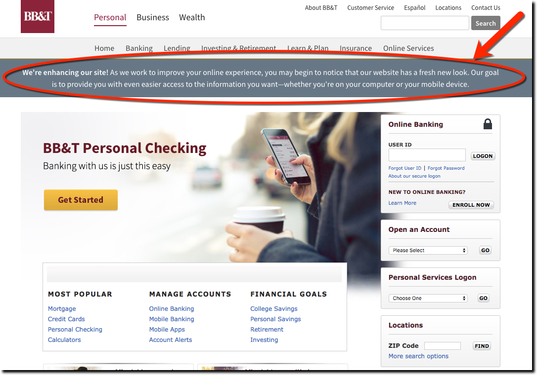
UX of Changing UI: BB&T Bank Teases Website Redesign
Site Redesign Starting on the Wrong Foot Personally, I don't like teaser campaigns. I want to know the whole story right now. But I understand how it can be an effective technique for engaging users. So I guess that's what BB&T is going for with their...
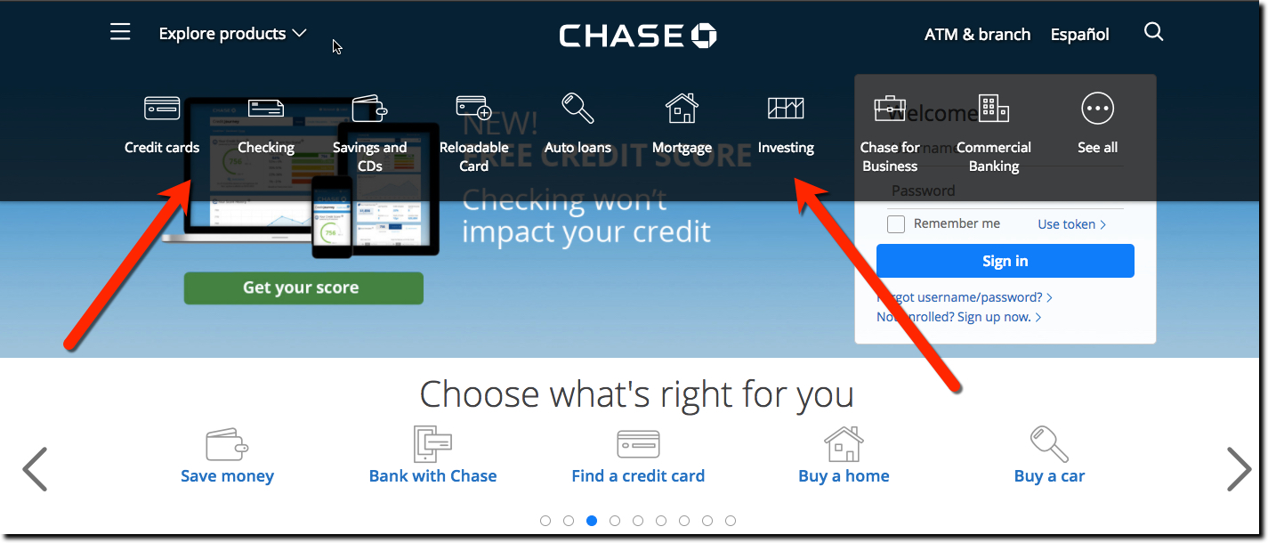
Navigation UX: How Many Choices are Too Many?
After years of look-alike websites from the major U.S. banks, we are seeing a divergence of layout approaches. Why the new found creativity? Besides (much) bigger budgets, much of credit (or blame depending on your outlook) is the new UI religion, responsive design,...
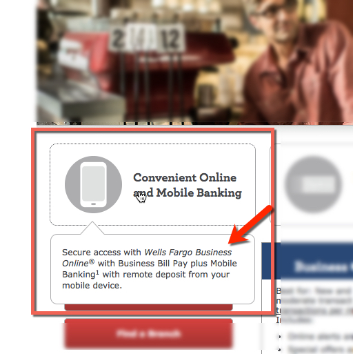
Landing Page UX: Wells Fargo’s Small Business Landing Page Delivers
Wells Fargo has 3 million small business customers (source). And given the number that go belly up every year, the bank has to work hard just to stay at the same level (even harder with this kind of publicity). So, it's no surprise Wells is an aggressive bidder on...
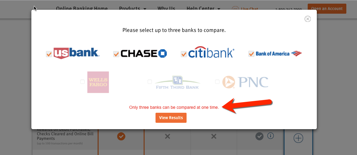
Marketing UX: Discover Makes it Easy to Compare Cashback Checking Against Competitors
We've seen many comparison tables matching a financial institution's (usually a credit union) best checking account to the competition (usually the mega banks). But we don't recall an interactive one (outside third-party comparison sites). Discover's page dedicated to...
UX Showcase: Rocket Mortgage
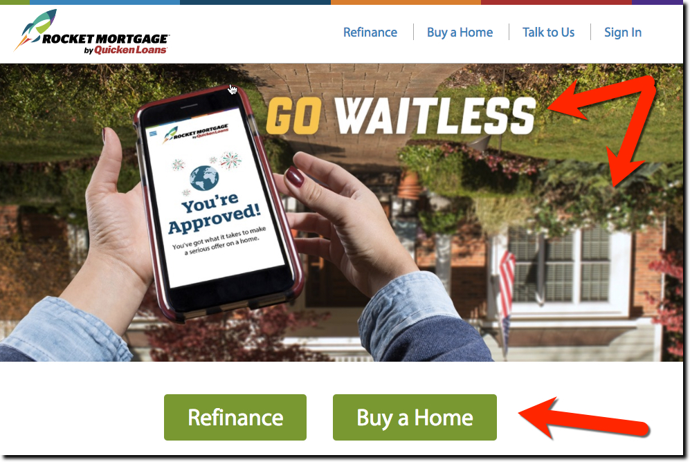
Although I find the upside-down background disconcerting (note 1), the overall messages on Quicken Loan's (QL) Rocket Mortgage homepage are excellent. Let's break it down. Screenshot 1: Above the fold This is the weakest part. I like the "waitless" pun, though I'm not...
Email UX: Capital One Delights with Tax Reminder
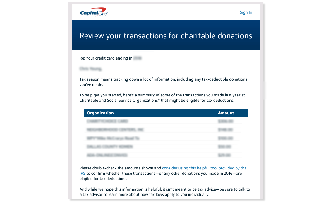
Not that I needed a reminder that tax season is upon us, still, the note from Capital One in this week was a pleasant surprise. The email recapped likely charitable transactions, several that I would have surely forgotten. Often in the digital banking world we lose...
Design Decisions: Should You Put a Mobile Screenshot on Your Homepage?
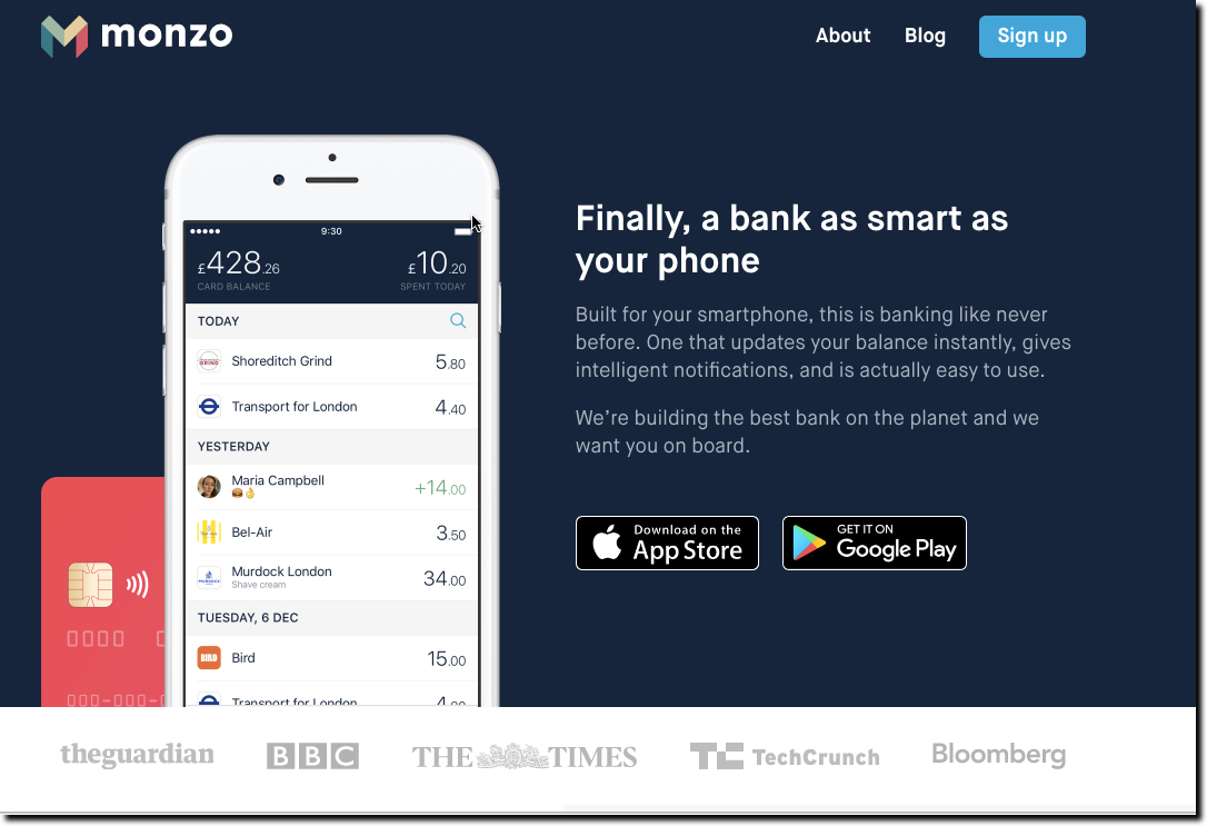
There is one big difference between established banking brands and the upstarts when it comes to homepage design. Upstarts almost always post prominent screenshots of their mobile experience, whereas legacy banks often relegate mobile to the depths of the secondary...
UI Showcase: America First Credit Union’s Navigation
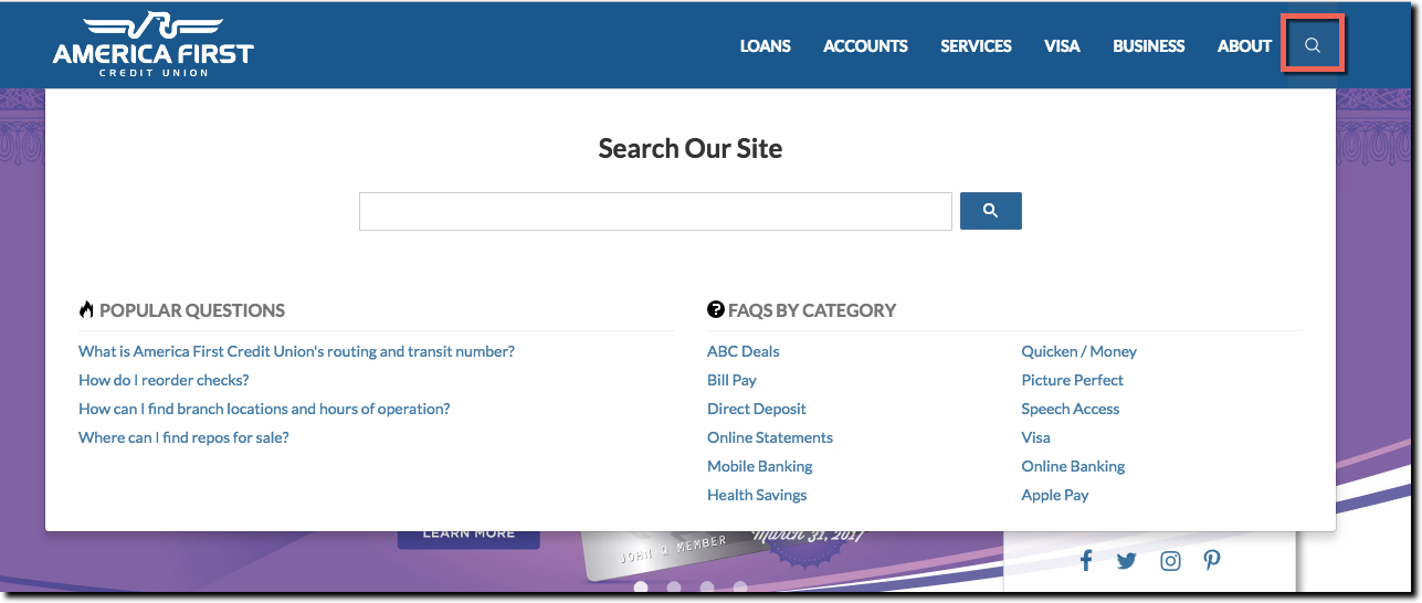
If you are student of innovative financial institutions, you are probably familiar 730,000-member America First CU out of Utah (the 7th largest in the USA). We've looked at them a number of times over the years (most recently here, note how their homepage has evolved...
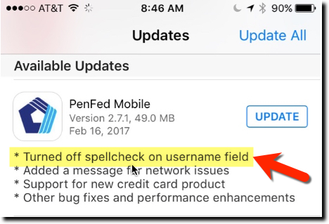
UX Tips: Turning Off Spellcheck for Usernames
Just when I thought our digital design template was complete, we run into another item to address on the road to the perfect UX. Today, it is spellcheck. While it's a wonderful tool, you absolutely do not want it enabled in the username field. Thanks to PenFed, who...
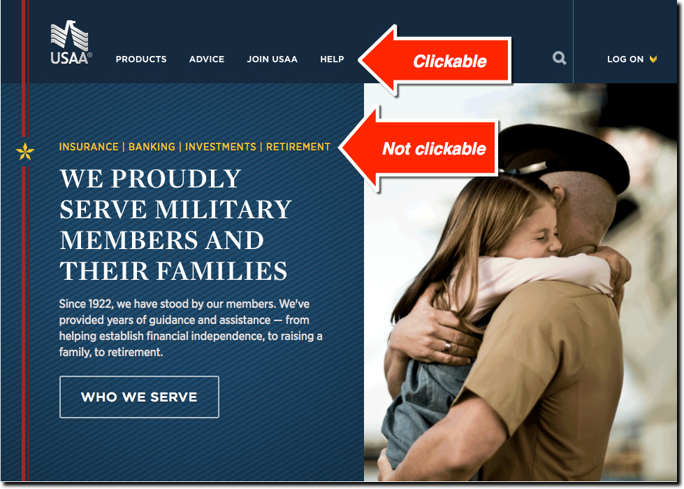
UX Fail: USAA Homepage Has Non-Clickable “Links”
I have long been inspired by USAA's innovation, mission, and execution. And have not written a negative word about them in 20+ years of covering the digital banking space. But like all streaks, it had to end some time. And today was that day. This morning I typed...

