Now that most serious digital banks sport solid-looking and responsive websites, we turn our attention to the hundreds of details that as a whole can differentiate you from the competition. And more importantly, show your customers AND employees, that you care.
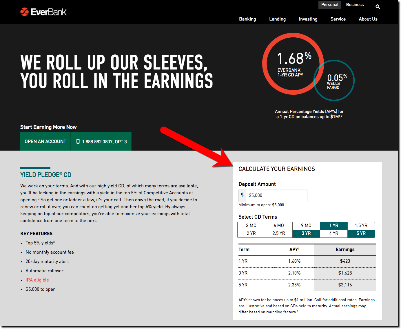
Everbank, one of the few direct bank survivors from the dot-com era (acquired by TIAA in June 2017), has a CD rate table is much easier to use compared than to a typical comparison tool. CD rates are shown in a simple 3-column matrix. Users can easily select various terms to compare simply by clicking the length choices at the top (see inset below).
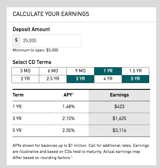 Bottom line: The layout makes it super easy to compare CD rates on the different terms with their CD rate table.
However, it took me a few seconds to realize I needed to click on an item in the top row to change what's shown.
My confusion stems from both the uncommon UI and the word “Select” which is meant to be a verb here, but can also be read as an adjective (i.e., a selection of CDs). So I recommend three changes to make the table even easier to use:
- Instead of “Select” say “Choose” for clarity.
- Instead of “Terms,” which is banking jargon, say “Length”.
- After “Choose Your CD Length” add a parenthesis “(click the boxes below)”
For extra credit, add a fourth column called “Annual Earnings” (or “Earnings per Year”) to make it easier to compare longer-term CDs. On the desktop, there is plenty of room for another column. On mobile, it may need to toggle between “Total Earnings” and “Annual Earnings.”


