Thanks to Pareto, we know 80% of your visitors are looking for just 20% of what you offer. And in that 20% is surely info about your digital offerings, especially mobile. But why do so many banks and credit unions bury their mobile capabilities?
Let's take a tour of several mobile-savvy mega financial institutions:
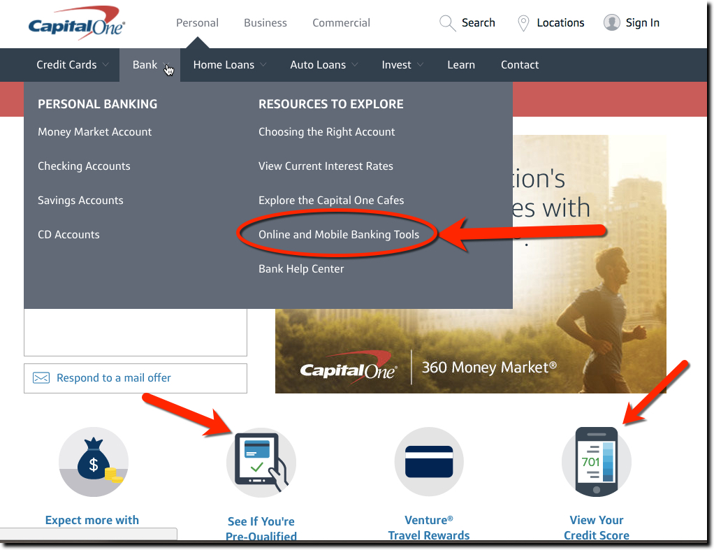
- Capital One: It may have invested $100+ million in mobile, but you wouldn't know that from its website. Mobile is tucked away on the far right of its Bank menu, under Resources to Explore column heading, called “Online and Mobile Banking Tools.” There are several mobile icons lower on the homepage, but they do not lead to info on mobile banking.
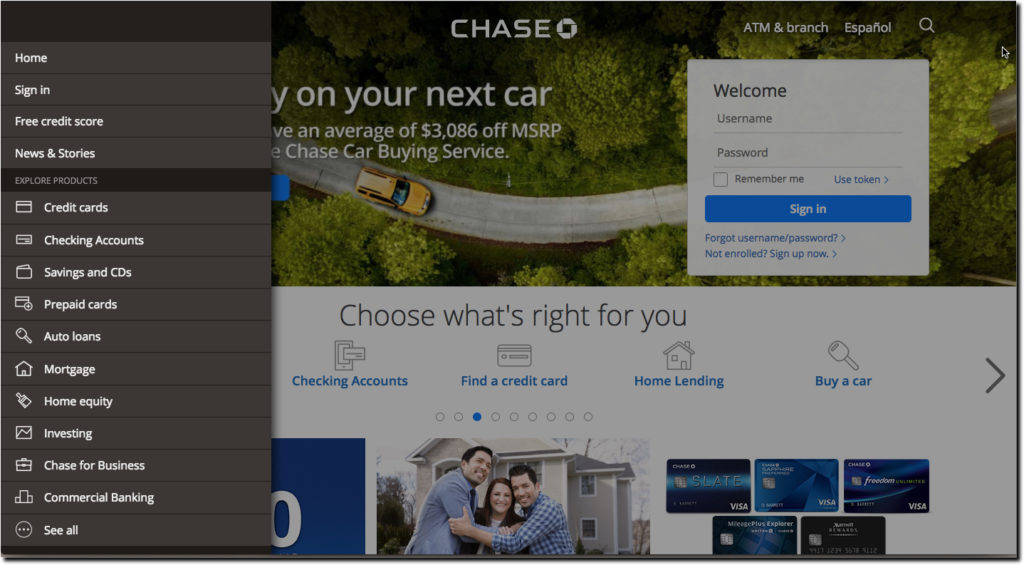
- Chase: Here's the company the pioneered mobile in its advertising campaigns 10 years ago when Blackberries were ubiquitous in the streets of Manhattan. Yet, now the bank has no links to mobile or online banking anywhere on its main menu or the first few screens of its scrollable homepage. A Chase Pay promo shown on a smartphone is on the third page.
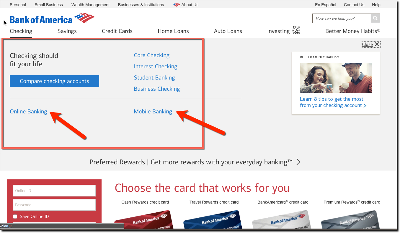
- Bank of America: The bank with the first iPhone app back in 2008, also seems to take it for granted its visitors are already well aware of its mobile capabilities. LIke Capital One, you have to click on one of the top-nav items (in this case, Checking) to find links to online and mobile banking. And like Chase, if you scroll down its responsive homepage a few screens, you'll see a promo about Zelle Pay.

Better UX
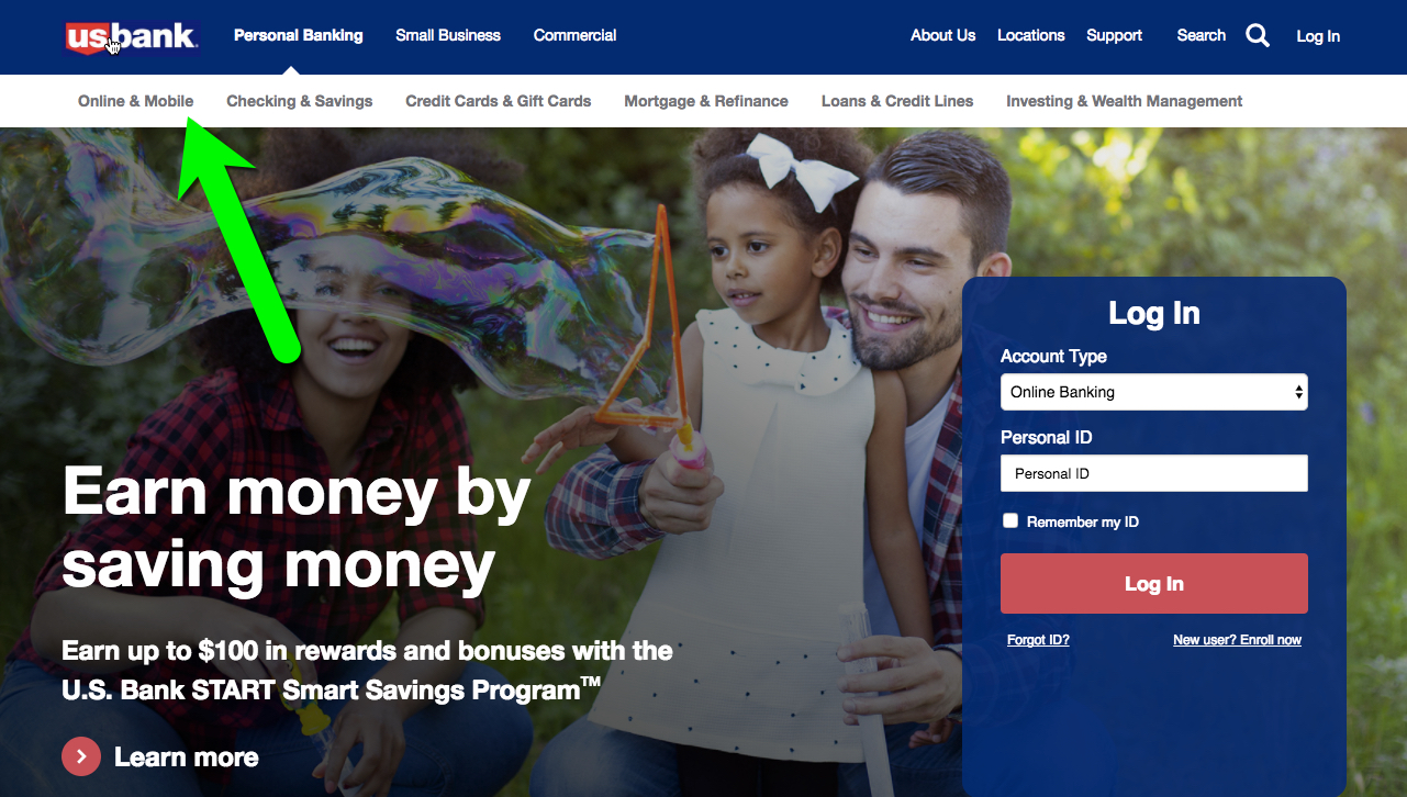
The word mobile should be visible on the webpage. US Bank includes it in its always-visible secondary navigation in a prime upper-left position. Ditto for Key Bank, though it's much harder to see over on the far right.

Best UX
But why be subtle about something so important to your future. Star One Credit Union proves it is best of class with Mobile & Online Banking as the first item on its primary navigation (Disclaimer: Star One is a client of our UX consulting services).


