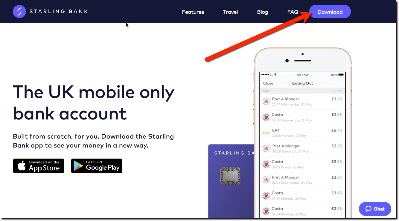
After reading CNBC's nice, albeit puff piece (worth a read) on Starling Bank's CEO Anne Boden, I headed to its website via laptop. As expected, the mobile-first British challenger bank has an attractive responsive site with three (of 5) primary navigation rarely, if ever, used by a bank.
In the upper right, where you often see a link to login, the startup has a prominent Download button (see screenshot above). In case you missed that, it also has large icons for the Apple and Google app stores in the middle of the page.
It's a savvy move. The rule of thumb is you have 10 seconds to grab a new visitor's attention. The bright green download button instantly signals that you've arrived at a mobile-first company, still a rarity in banking. It also provides a direct mechanism to move the prospective customer right into the sales funnel. The equivalent of an Apply Now button on a traditional website.
Starling also chose to put Travel into its main navigation. It's a bit of an odd choice, but if that's the initial target demographic for the startup, then it makes sense. At the very least, it helps differentiate the bank from others. The downside is that the term is not really something you associate with a bank, so they may lose some visitors who think Starling is a travel app.
The other primary navigation button I've not seen before is FAQ. I'm not a fan of that decision. FAQs are great, and every consumer provider should post them. However, I don't think you want to send visitors into your FAQs so quickly. First, engage them with content (e.g. Features) or action items (e.g. Download), then help answer their questions with an FAQ.
Bottom line: Your primary navigation choices say a lot about you to new visitors. Make sure you test each word and variation with users.
