Site Redesign Starting on the Wrong Foot
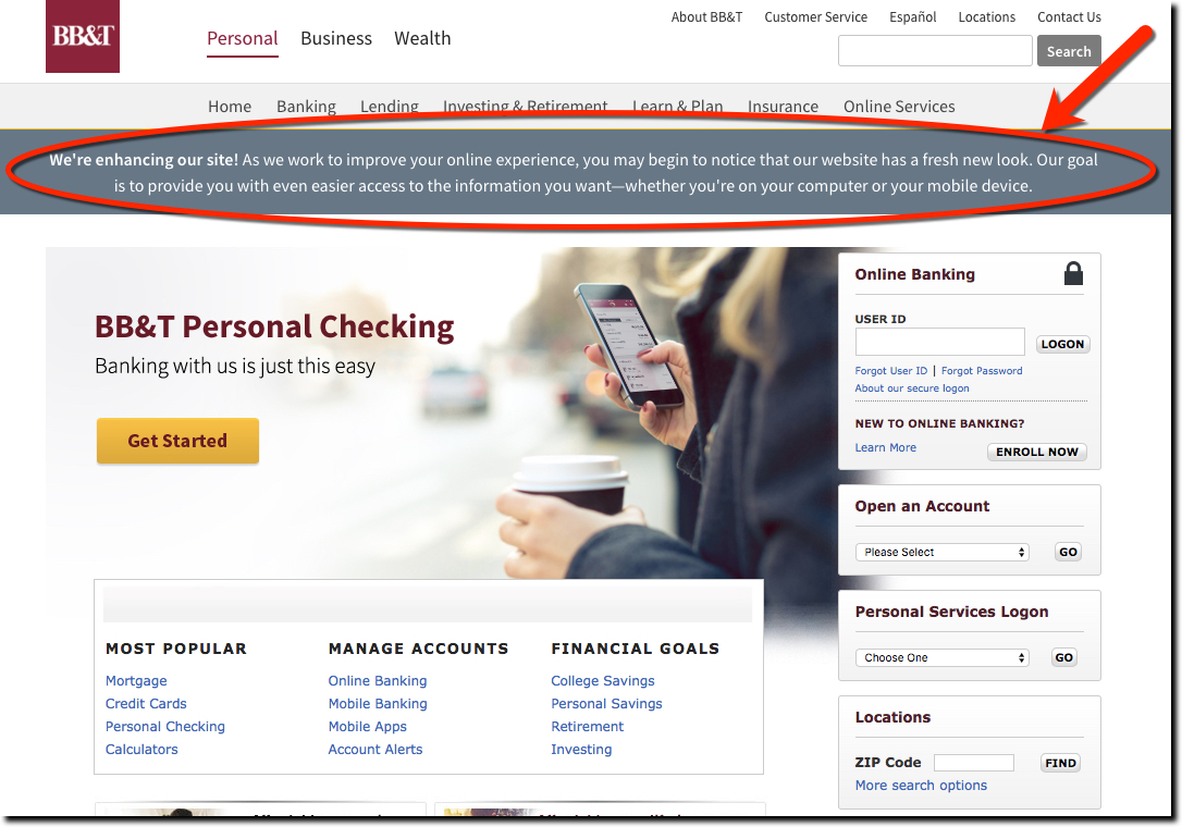
Personally, I don’t like teaser campaigns. I want to know the whole story right now. But I understand how it can be an effective technique for engaging users. So I guess that’s what BB&T is going for with their top-of-the-homepage message today (screenshot below):
We’re enhancing our site! As we work to improve your online experience, you may begin to notice that our website has a fresh new look. Our goal is to provide you with even easier access to the information you want—whether you’re on your computer or your mobile device.
Overall, I think it’s a flawed tactic here. Usually, “bulletins” at the top of the page are reserved for something urgent, like a snowstorm closing the branches. When I first saw the message (which, BTW, is a hard-to-read small white font on gray background), I expected a “pardon our dust while we remodel” warnings.
But the bank doesn’t appear to be worried about website downtime. It’s just bragging about a coming website redesign. A classic tease. If that’s the case, BB&T should provide more detail both in the copy and with a link to a landing page spelling out the benefits and screenshot illustrations. Instead we just get this passive copy: “you may begin to notice that our website has a fresh new look.”
Bottom line: BB&T’s bank website redesign approach just leaves readers scratching their heads about why they bothered to read the message.
That’s never a good start.


