 What is Zelle?
There has been little criticism of the new Zelle-branded P2P payment service, probably because it’s been working great as a white-label solution at its bank owners for six years. But I’m not convinced the rebranding as Zelle is step in the right direction. On the plus side, it allows them to create a standalone app so customers of non-participating banks can get to their money faster, but that’s not enough to overcome the confusion of a new brand. But before I make that case, let’s review the short history of P2P payments in the United States (more detail here).
Seventeen years ago PayPal took on Wells Fargo’s Billpoint (joint venture with eBay) and Citibank’s (C2IT) fledgling P2P payment services. The battlefied at the time, was primarily on eBay, where the vast majority of P2P ecommerce occurred. It wasn’t a fair fight. With a $400 million VC war chest and an all-star exec team (Elon Musk, Peter Thiel, Max Levchin, David Sacks, Reid Hoffman and so on), the contest didn’t make it past the first round. Within a year PayPal had a stranglehold on eBay payments with its superior UX, aggressive business model, and network effect.
Now the banks are back with Zelle, a rebranded version of the clearXchange that has been up and running for six years. The service already has great traction. In 2016, Early Warning, the bank-owned operator (see note 1), processed 170 million transfers totaling $55 billion for the 85 million customers of their big-bank owners. That works out to exactly 2 transactions per customer annually with an average of $320 per transfer.
The value transferred last year is already three times the size of Venmo’s $17.6 billion in volume, though the number of Venmo transactions is probably higher, perhaps considerably higher if its average transaction size is in the $15 to $20 range implying 1 billion venmos last year.
Using Zelle
Last week, I used the new Zelle for the first time. I tested both the desktop and mobile versions from Capital One and just the desktop service at Chase. Other than a significant glitch where I could not register with my mobile number (and that’s a big caveat, since it would stop many users in their tracks, see #8 below for more info), setup was quick and easy.
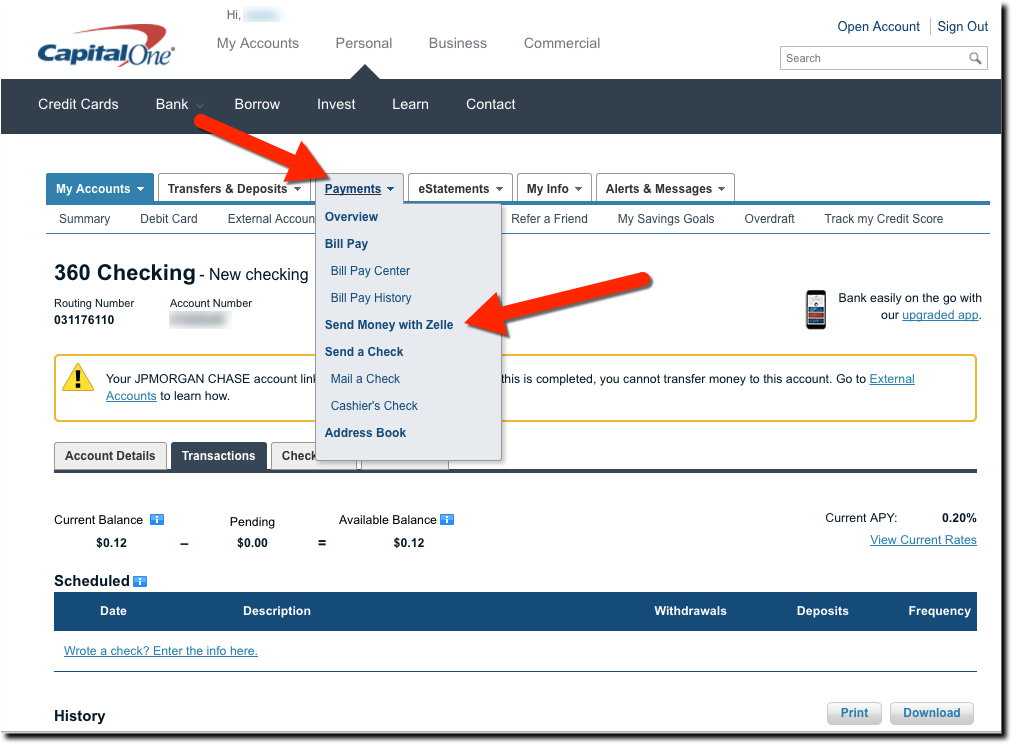
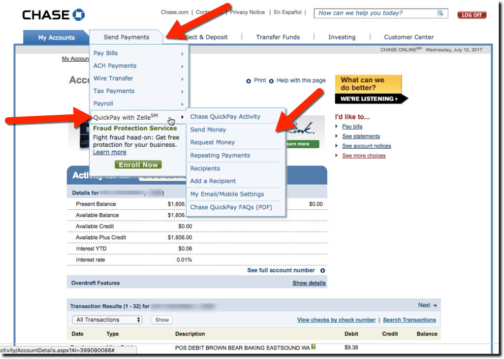
The Capital One desktop version is pretty straightforward, with a Send Money with Zelle link in the middle of the Payments menu (see screenshot above). This assumes you know what Zelle is, or you just ignore it since it comes after the key words, “Send Money.”
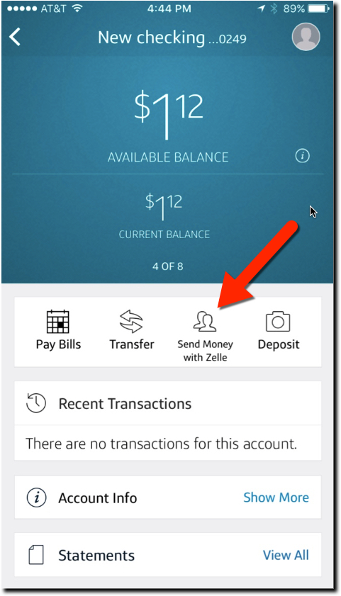 But the mobile UI is less intuitive. It wasn’t initially obvious how to use it because there is no Zelle or payments navigation item in the Capital One app…yet (it’s only been out since June 12). However, once you go to the checking account section, it’s one of the main navigation items at the top (see inset below).
I was initially surprised at what happened with my test payment. I sent a buck to my son (sorry, Paul I only had $1.12 in my account) and I was pleasantly surprised to find that my payment had been “qualified for expedited deposit” and he’d have the cash right away without the usual ACH delay.
But when my son forwarded the email he received, I was surprised to find that my Capital One payment has morphed into a branded Chase QuickPay with Zelle. There was no mention of Capital One anywhere in the message (see screenshot below).
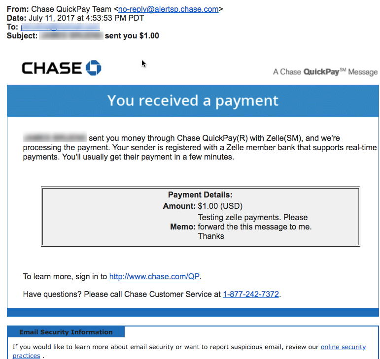
That makes sense now. My son has a Chase account and was already registered with Chase QuickPay. If he’d not already been registered, he would have received a Capital One branded email (see screenshot below).

Zelle Payments UX Issues
I like what I’ve seen so far, but there are a few signs of big-bank disease that makes me wonder whether Zelle has the mindset to compete with the non-bank players such as PayPal, Square, Alipay and the others.
For example:
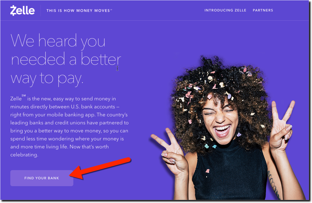
- The main call to action on the Zelle site is, “Find Your Bank” not “Get Started” or “Send a Payment” or something that solves the need you have (sending a payment) rather than causing you to get away from the Zelle site as fast as possible (see screenshot below).

- For the brave souls actually clicking the button, they are dropped onto a homepage that says NOTHING ABOUT ZELLE at Capital One, Chase, Fifth Third and PNC Bank. Congrats BofA, 1st Bank, US Bank, USAA, and Wells Fargo for explaining what to do next.
- Hard-to-find customer service. Banks, and their payment brands, are in the trust business. If you don’t trust the safety and security of a new service, you aren’t likely to use it (unless you have no choice). The Zelle website looks big budget, has bank logos on it, and overall makes a good first impression, a key element of trust for a new financial service. But then it shoots itself in the foot by burying customer support in the footer and uses a generic term, Support, that many users won’t associate with a contact area (Contact Us is much more user friendly).
- Customer telephone number required on contact form: I applaud Zelle for having both telephone and web contact form support. However, don’t require a phone number on the form. It just makes it seem like you are going to get a high-pressure sales pitch.
- No “About Us” or FAQ section: The website is too bare-boned for a company claiming to connect 80 million Americans financially. Inquiring minds want to know more, and the site fails the simple credibility test with no About Us or FAQ.
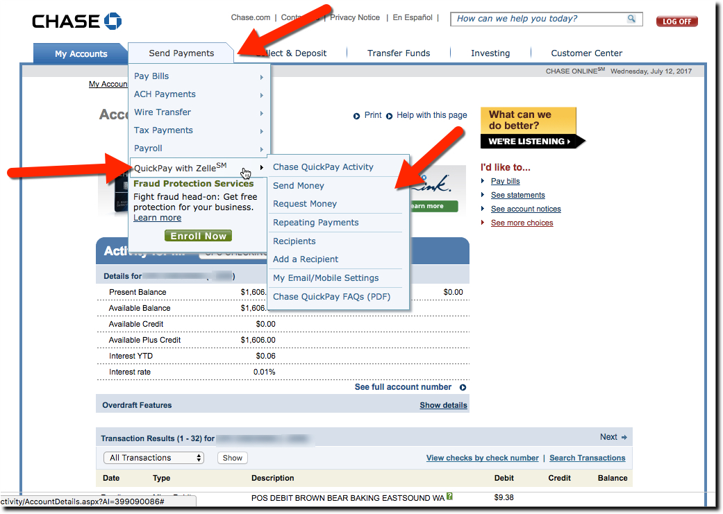
- Branding friction: The Capital One email announcing Zelle is littered with SM marks every time they use the term. There is nothing that screams corporate runaround more than an SM or TM every other sentence. Worse, you have situations such as Chase calling it Chase Quickpay with Zelle, who is going to remember that? (see screenshot below). There is zero chance that ends up as a verb, just try substituting the Chase name for Venmo in this sentence, “I’ll venmo you the $20 for the ticket.” (see also “Why the New Brand” below).
- The URL is Zellepay. While that’s not a huge drawback, it still causes one to pause and decide whether the email from Zellepay is real or SPAM. Unfortunately, Zelle.com is used by a good sized law firm. Still, would it be worth $500,000 to $1 million to convince the Minneapolis firm to move their practice over to ZelleLLC.com or Zelle.law? After all, they aren’t going to enjoy the millions of spams and hacks about to be unleashed wrongly on their URL.
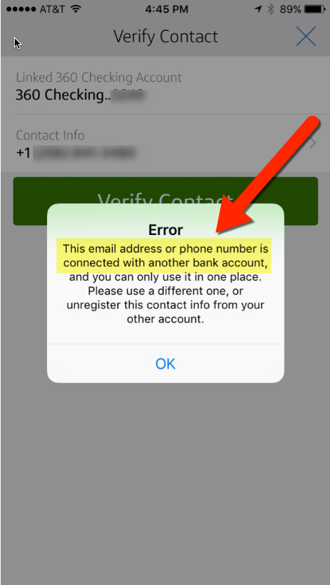 Error message when I tried to use my mobile number as contact to send Zelle payments (see inset). I thought it might be an issue particular to my account at Capital One, but from the cryptic message I received on my phone, it sounds like my phone is registered at another bank. And that would be a big concern for most customers who would fear that some identity thieve is hard at work extracting cash from their account. Nick Holland has more on the problem, which it turns out is not unique to my account.
- Editing Zelle info after setup. I see nothing in Capital One’s mobile app about changing my contact info in Zelle. Not good UX.
Why the new brand?
Zelle/clearXchange will continue to grow at a good clip if its big-bank owners stick with it. It’s already 3x the size of media darling Venmo (owned by PayPal). But I’m not sure the massive investment in creating a new payments brand is worthwhile (cut to the boardroom discussion of a 2018 Super Bowl ad).
I get that they are trying to create another Visa/Mastercard network that consumers recognize and trust. But unlike credit transactions at the POS in the 1950s and 60s, p2p payments are relatively understood by consumers and have much less need of a third-party organization to achieve the network effects. The big banks are already wired to each other and what’s needed, what clearXchange was already offering, is just a simpler UX inside each bank’s online and mobile application. Adding the Zelle name to the mix seems like a step backwards on that front.
Bottom line: Maybe I’m wrong and we’ll all be Zelling money to Mars in a few decades. But I’m not convinced the new brand will stand the test of time, unless it is backed by an enormous amount of advertising (which could happen). Regardless, I do love the service, which I expect to flourish.
Notes:
- Owners of Early Warning (aka Zelle) are: Bank of America, BB&T, Capital One, JPMorgan Chase, PNC, U.S. Bank, and Wells Fargo.
- If I were any bank other than BofA and Capital One, I’d be crying foul over how the banks are listed in alphabetic order. On the desktop, it doesn’t matter (yet) since they are all above the fold. But on mobile, you can only see BofA and Capital One, and there is no indicator that you should scroll for more.
- Image credit: Buy your Zelle shirts here.

