
Last week, we told you that we were open sourcing our 400+ UX guidelines starting with the digital account opening process. Today, we bring you a slice of those best-practice guidelines with our favorite 11:
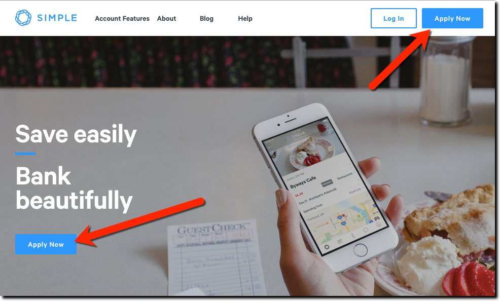
Make it easy to find your “Open an Account” button
It’s so obvious that I hesitate to lead with this guideline, but you’d be surprised how hard it is to find out how to get a new account started at many (most?) financial institutions. And that speaks volumes to what users can expect in terms of overall UX once they are a customer. The “Open/Apply” button should be shown above the fold and ideally, in more than one location (see Simple Bank above). And while you are at it, ditch the “Apply” label whenever possible. Instead use, Join, Get Started, Register, Sign up, Open an account, Become a member/customer and so on. Your homepage is not the place to play hard to get.
Ensure your forms look super secure
We’ll leave the security details to your IT staff. From a UX standpoint, make sure the entire application process “feels” safe and secure by adding security graphics and language on every page and every step.
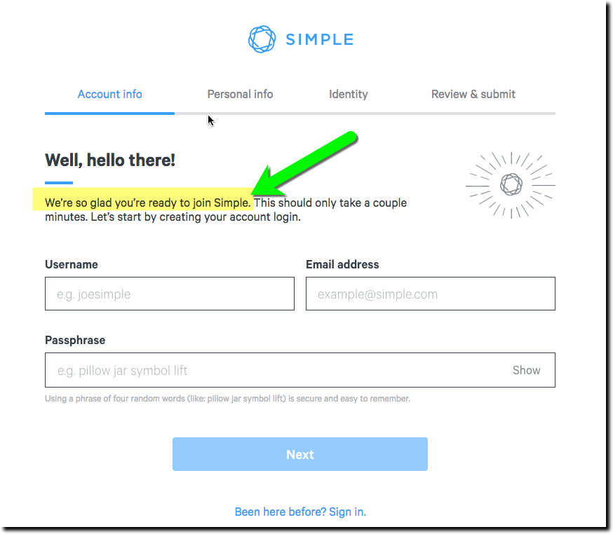
Start with the easy stuff first
The best applications start with just two pieces of information on the first section, name and email address.
Break the form into single screen chunks
After collecting those two critical pieces, only ask 3 or 4 questions before each “submit” button. That way you can look for errors right away and your customer doesn’t get overwhelmed and walk away from the page.
Make it easy to stop and start later
Every professional application should have the ability to be saved and continued later. A few thousand dollars spent on this capability will be paid back with months (or even days depending on your volume).
Provide chat and one-ring phone support every step of the way
This isn’t the time to save money by burying human support options. You should either have real-time chat or a highly visible phone number readily visible on every page.
Say THANK-YOU from a real person
Say thank-you after the form is submitted, and say it like you mean it with large fonts and attractive graphics. For extra credit, make it from a real person, ideally, someone in the local area (if possible) customers could contact (eg. not the CEO).
Explain the next steps in detail
Outline the next steps and timing in excruciating detail and display the info on screen and in a confirmation email. Also, include contact info for questions.
Let customers access the account right away
Create a good first impression by letting new customers log in to their new account right away even if it’s pending some approvals on the back-end. And make sure there are some supportive new-account instructions at the beginning.
Keep communicating until the account is funded AND used
You don’t have anything until the account is funded and/or used. You should develop a series of onboarding messages that lasts for many months, starting with a frequency of 2 or 3 per week, and slowing down to once per week until the account is active.
Have fun!
This isn’t even one of our “official guidelines,” but there should be a certain amount of joy when you get a new member or customer. We sometimes forget in all the seriousness of money management, that we should also display genuine human joy at a new connection. Seattle Bank sends a small box of wine, chocolates, notepads and pens to new clients. That gesture will be remembered long after the new account honeymoon period is over.
If you’d like help with any of this, please reach out to me, Jim Bruene, jim@netbanker.com or my co-founder, Chris Young, chris@fintechlabs.com.


