WSECU’s homepage reflects its all-out effort to help members through the pandemic (12 May 2020)
When I wrote my first pandemic-era post in April, I looked around for financial institution examples that illustrated the much-needed empathy as well as clear discussion of issues customers were facing such as where their stimulus check might be. That was still early days in the economic response and most FIs had little more than brief messages about closed branches and apologies for extended on-hold times.
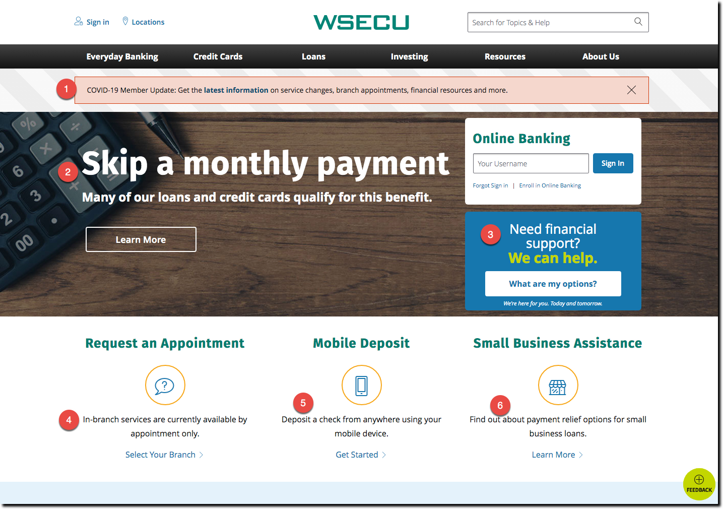
But as the pandemic drags on past the two-month mark in most areas, FI digital messaging is much more evolved. Case in point: Washington State Employees CU (WSECU) whose website is all-in on helping its members. The CU uses every bit of its above-the-fold space to provide helpful messages (numbers below correspond to those on the screenshot above):
- Emergency banner across the top leading to a detailed pandemic resources page
- Large promotion about the availability of loan payment skipping options. This is one of 3 rotating promotions, the other two are also related (general help message similar to #1, and a message about stimulus checks, see screenshots below)
- Need Financial Support box with a link to detailed resources
- Request an appointment since branches are closed to walk-in traffic
- Mobile deposit explainer for those new to that technology
- Small business assistance promotion leading to a resource page
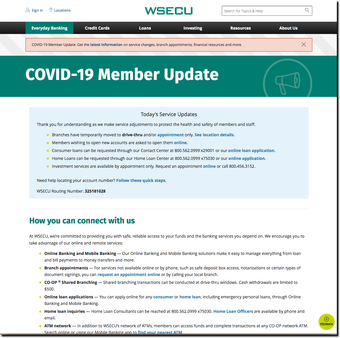
The CU also has a single page listing all its key information on a single page including contact info, relevant member services as well as frequently asked questions about the stimulus payments (see partial screenshot below).

Bottom line: I’m not sure what more you could ask of a financial institution. The CU is empathetic, helpful, and completely in line with the times. Nice work!


