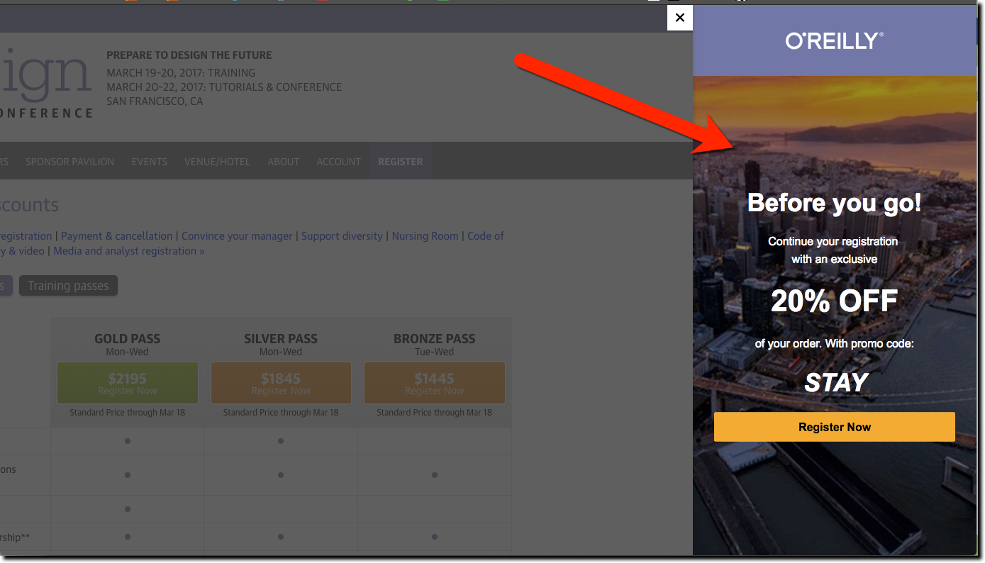

As a UX and conference junkie, I was thinking about attending O’Reilly’s UX Design conference so I was perusing their website. I took the usual path of someone interested in attending, eventually landing on the pricing page. After satisfying my curiosity I did what 98% of web users do, I moved my mouse up and left toward the back button.
But before I arrived at the button, the website performed a nifty trick. They simultaneously grayed out the page, shifted it to the left about 25%, and “revealed” an offer on the right-side (see screenshot above) to take 20% off the ticket price. The offer popped, partly because of the surprise, partly because of the contrast with the grayed out page I’d just been looking at, and partly because it was simple and right on target.
It’s better to see for yourself. Go here, then move your cursor up and to the left.
Bottom line: This technique could be used on any financial product page to get users to reconsider your services. I didn’t test it, but it probably avoids being thwarted by popup software detectors. And there is less “popup fatigue” where users simply swat the popup down without reading.
The downside, as you learned in Mkt 101, is you are training your customers to expect an offer/discount every time they visit.
