
Let me start by saying that I’ve been a fan of Umpqua Bank since I saw then-CEO Ray Davis present his pioneering branch designs at BAI Retail Banking in the mid-1990s. And that’s saying a lot, because I am no fan of the bank branch.
The other day I visited Umpqua Bank online. So now I’m being stalked by their ads. Figuring that I might have a good candidate for my Friday Fun column, I clicked on the one running against a crypto taxation story on Reuters today (see above).
I was impressed with the tagline, and looking forward to the proof points:
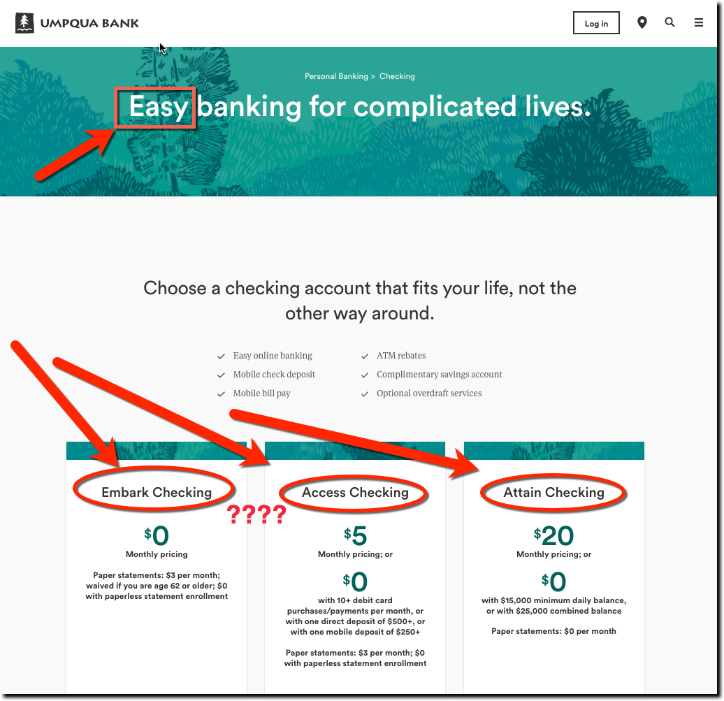
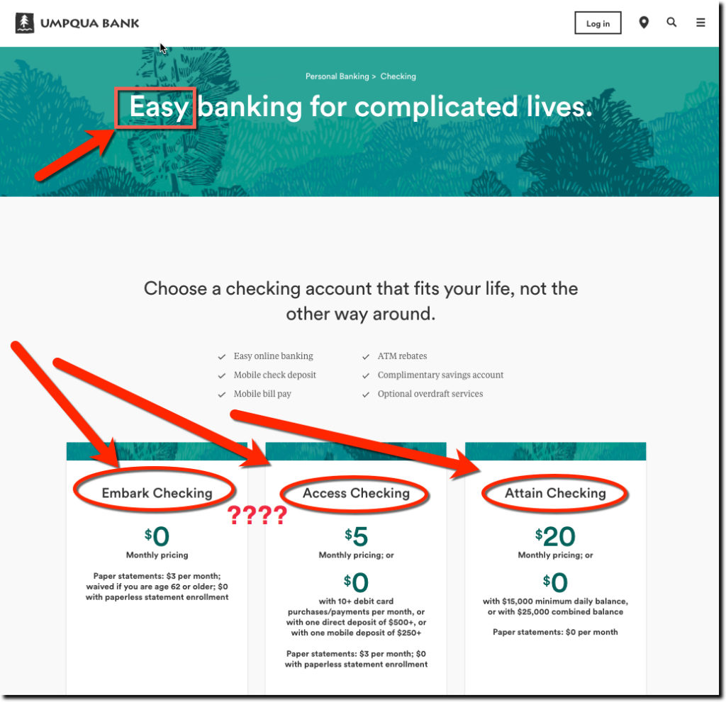
Easy banking for complicated lives.
But then I scrolled down the page (see below) and was met with three confusing choices for a checking account. Not only do the accounts have nonsensical names (Embark, Access, and Attain) that are of no help in making a decision, they have fine print about $3 statement fees, debit card usage minimums, and so on. I appreciate their candidness about the requirements, but the product presentation is the opposite of the ad’s promise of Easy.
Bottom line: A good user experience starts from the moment a prospective candidate lands on your website, landing page or mobile app.
If possible, provide a single, obvious path to buying the product.
<end rant; have a great weekend!>
Umpqua Bank landing page (link)
