No one visits a banking site for entertainment. Users are either there to make sure nothing bad has happened or that bad thing already occured and they need help fast.
It’s a digital banking fact:
Every login is accompanied with some level of anxiety.
That’s why it’s so important to greet customers in a calming way, with a simple layout and no salesy stuff. But banking websites and digital banking platforms rarely deliver on this need. Instead, they insist on showcasing every possible product/service on the homepage, dumping every balance and transaction on the user at login, interrupting the task with post-login interstitial promos, and burying help resources 3 or 4 clicks off the main page.
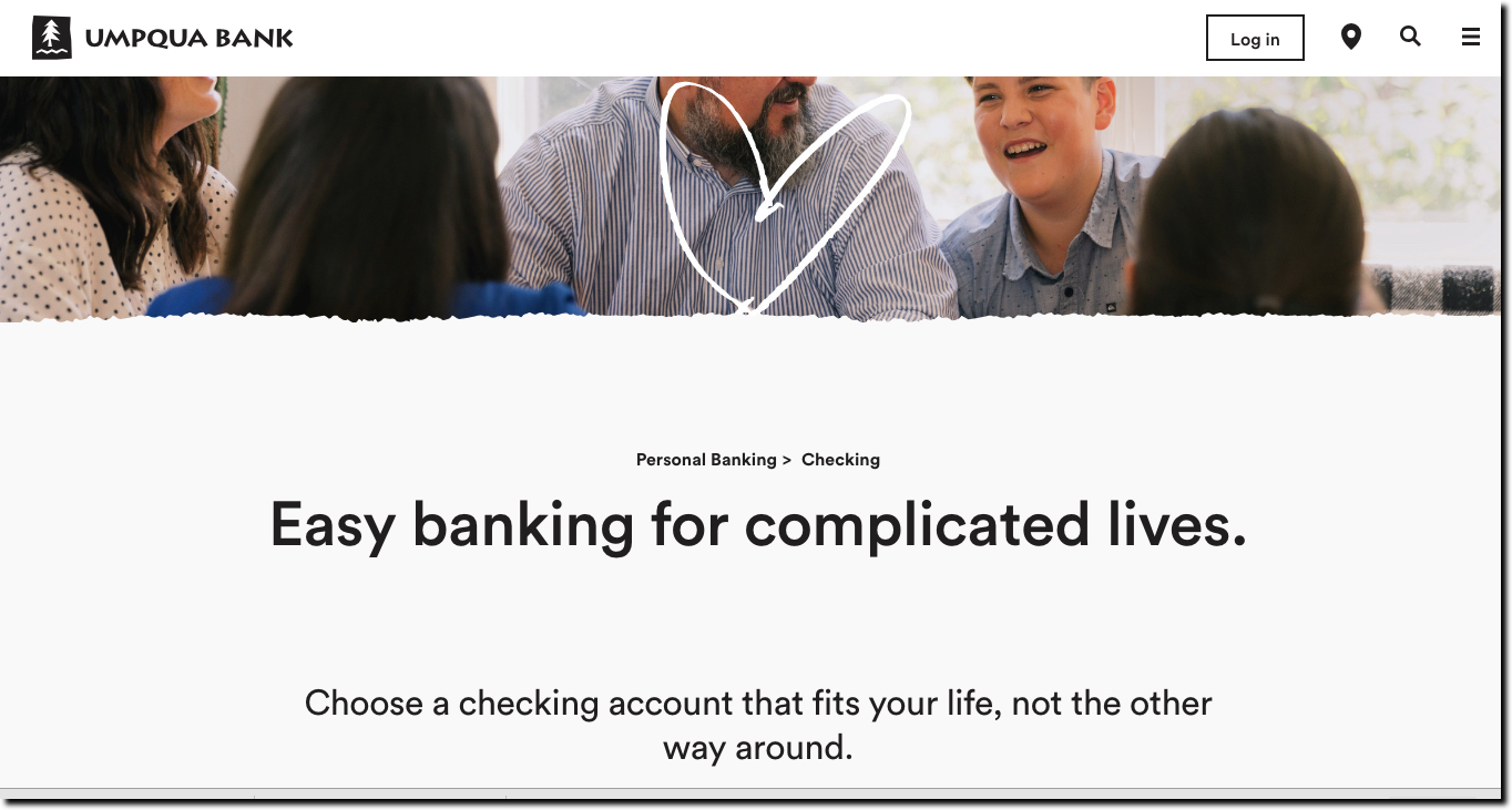
While this keeps internal constituents happy that their pet product gets a share of prime real estate, it’s often a bad experience for customers seeking to reduce stress, not learn about new opportunities. Umpqua Bank, for one, shows great restraint in its new website design, which has a calm, uncluttered look (see screenshot at top).
Bottom line:
Great digital banking should calm your overstressed customers not create more financial fear and dread.

