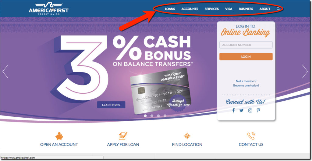
If you are student of innovative financial institutions, you are probably familiar 730,000-member America First CU out of Utah (the 7th largest in the USA). We’ve looked at them a number of times over the years (most recently here, note how their homepage has evolved since 2012).
I turned to them for some Monday morning inspiration and they didn’t disappoint. The responsive homepage is gorgeous (screenshot above) and its three rotating promotions grabbed the eye. But what got my attention was the CU’s primary navigation choices.
Rather than the typical “Personal & Business” you often see, they used:
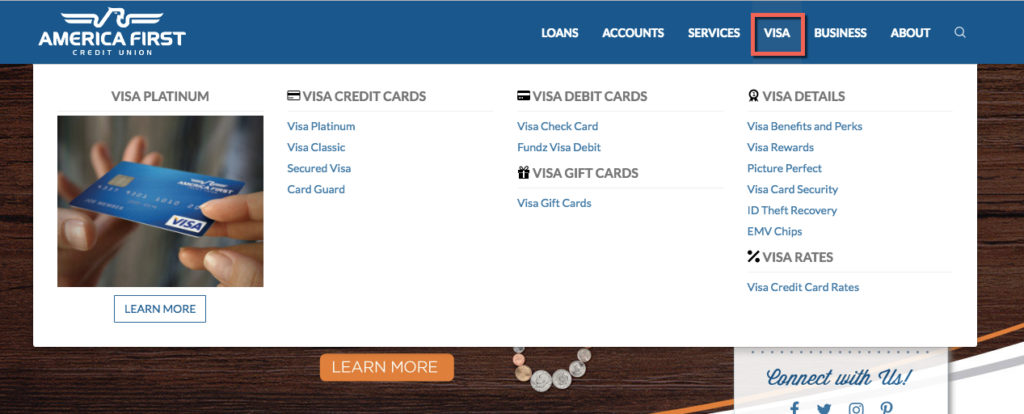
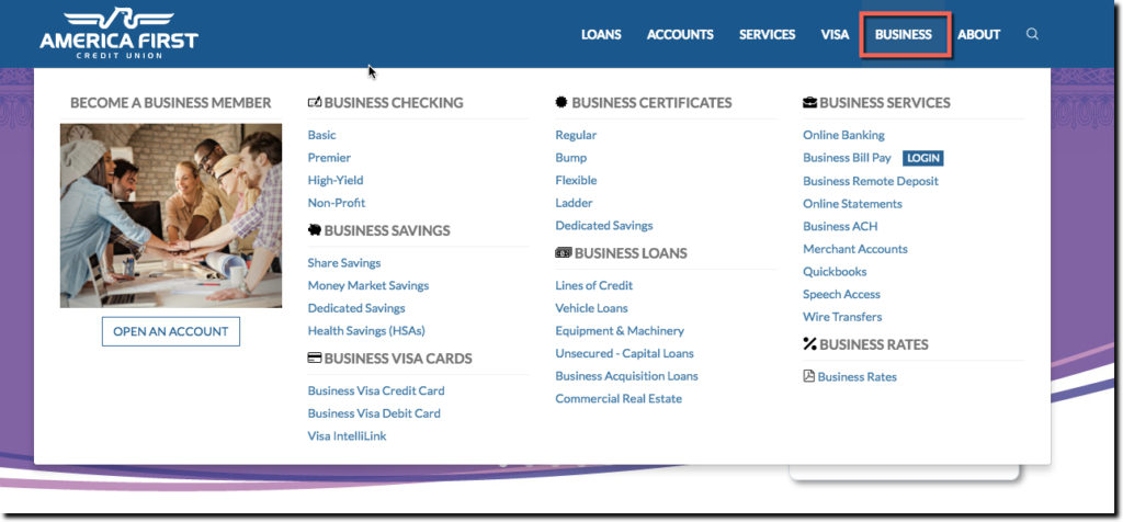
Loans | Accounts | Services | VISA | Business | About
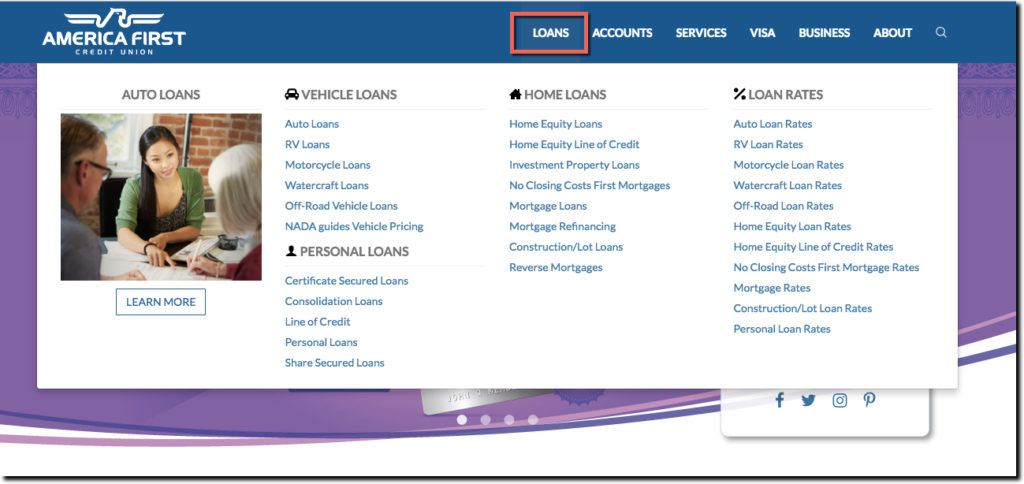
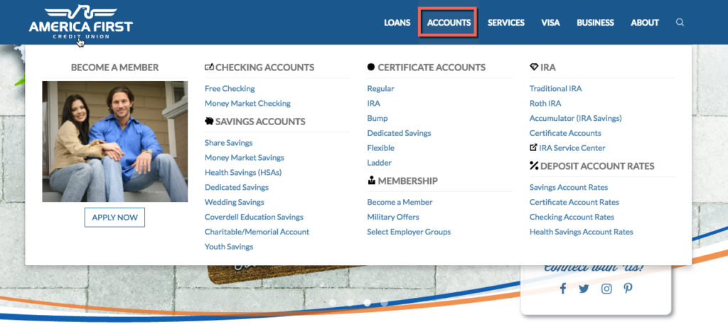
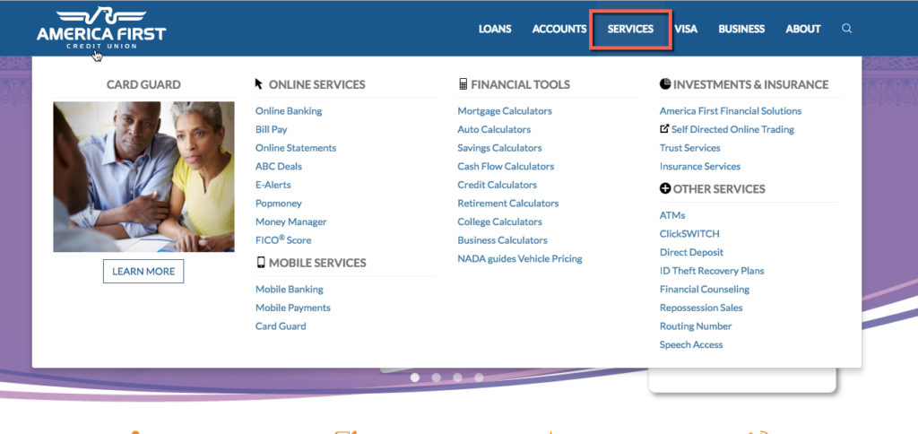
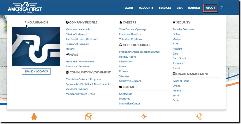
And then the drop-down secondary navigations were large, but very well laid out. You can see their attention to detail, even on the About menu (screenshot number 6 below).
Note: Click on any screenshot for a larger view. Red boxes around navigation items were added.
1. Loans drop-down menu
2. Accounts drop-down menu
3. Services drop-down menu
4. VISA drop-down menu
5. Business drop-down menu
6. About drop-down menu
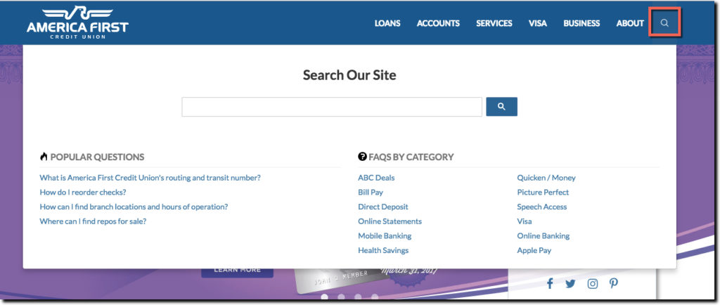
Finally, even the CU’s Search menu is well-crafted. Rather than just using a free-form box, they embellished it with links to other resources a searcher might want to use such as FAQs and Popular Questions. The only thing missing, is a link to Contact Us, for those that aren’t finding what they need. However, they do provide a below-the-fold link to Contact Us after a search is completed, an acceptable way to encourage self-service without hiding your contact info.


