 Banking websites are built to serve multiple goals (e.g. sales, service, marketing, and so) across an array of business units. That’s why they often appear so unwieldy.
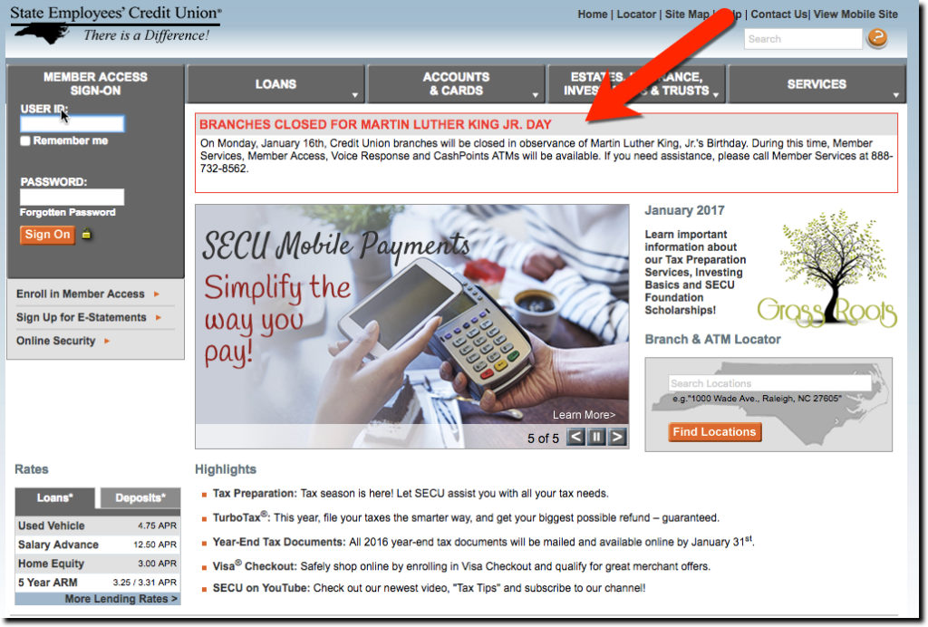
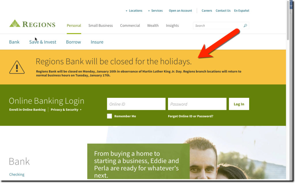
And with all that complexity, it’s easy to lose sight of one key function: communicating timely information to customers. Unplanned situations, such as weather-related closures, are the most difficult to pull off, though UI expectations are low. With everyone scrambling around in crisis mode, it can be hard to marshall the resources to push through a website change. You need to have a simple “emergency” update process to add text across your homepage (see Bank of Oklahoma, State Employees CU, and Regions below).
But others, such as national holidays, can be planned for months in advance, so there is no excuse for ignoring them and not adding a bit of polish to the execution. However, we still find that many (most?) financial institutions rarely communicate holiday hours of branches and call centers.
 For example, today is the newest national holiday in the United States honoring activist Martin Luther King’s birthday. It’s a Federal holiday, but much of the country is still open for business, so most customers are unsure whether bank branches are open normal hours.
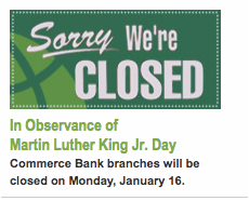
So we took a nationwide tour of the web today (noon to 1pm Pacific time) and found almost no recognition of the important day or its impact on customers. Of the 50 largest U.S. banks, only 3 bothered to mention their MLK day closure (see Commerce Bank graphic, upper right and below). And given how important Martin Luther King Jr. was to fighting racism, it’s also an easy win to honor the man with a picture, quote or even a link to his wikipedia page. But none of the top 60 or 70 financial institutions posted even the smallest detail about him. Finally, through Google image search we found a few credit unions posting something about the man behind the holiday.
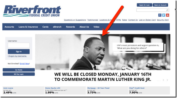
Our favorite was Riverfront FCU with this inspiring picture and quote prominently displayed on the homepage, the first of 4 rotating promos:
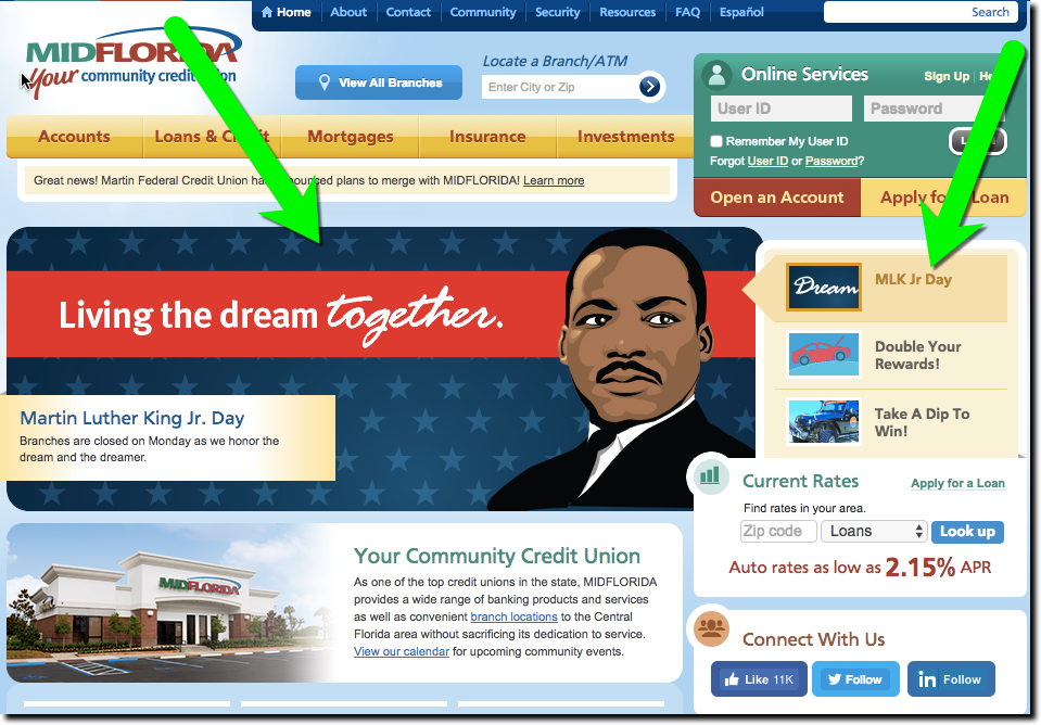
We also like the MIDFLORIDA Credit Union effort with the first of 3 homepage promos devoted to honoring the Martin Luther King Jr.
And Commerce Bank was one of only three top-50 banks that bothered to mention holiday closures on their websites. The green sign under a green homepage is easy to miss, but the “Sorry, we’re closed” sign is a good visual clue. However, given that a surprise closure can be inconvenient for customers, the sign may be just a bit too cute. We’d like

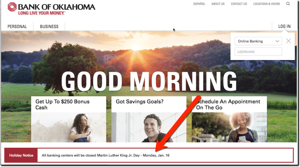
Bank of Oklahoma’s eye-catching homepage featured an effective red alert at the bottom explaining the holiday closure. We give it a B+ for effectiveness, but the bank still missed an easy opportunity to add a quote or link to honor Martin Luther King.
State Employees Credit Union also used red to grab attention and placed the notice near the top. The all caps headline gave it bit of an amateurish look, but the CU was the only one to remind customers they could use alternative channels. So overall, it was very effective.
Regions Bank had the biggest message taking up about 25% of the homepage real estate. However, it seemed oddly out of place, almost like a 404 error page. We’d prefer something that looked like a little more thought went into it. For example, it said the bank was closed for the “holidays” (plural) as if the sign had been hanging there since Christmas/New Years. And the font used to explain the details is too small for good readability.
Bottom line: Use your homepage to communicate unusual information such as holiday closures. And for extra credit, add holiday inspired graphics and offers.


